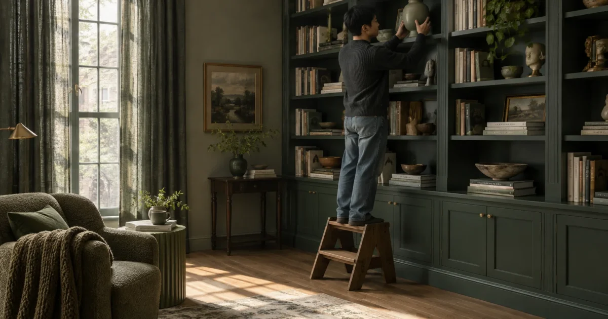
Monochromatic decor turns chaotic living spaces into calm, unified sanctuaries when you plan every layer with intention. A single color room design can quickly look dull or overwhelming if you choose the wrong combinations.
Learning how to avoid classic monochromatic room mistakes protects your renovation budget and preserves your design vision. Tonal interior design relies on subtle contrasts rather than identical matches.
Sidestep five widespread decorating mistakes to give your space depth, elegance, and tactile warmth. With the proper techniques, you can master a single-hue palette like an experienced professional.
Project Overview & Why It Matters
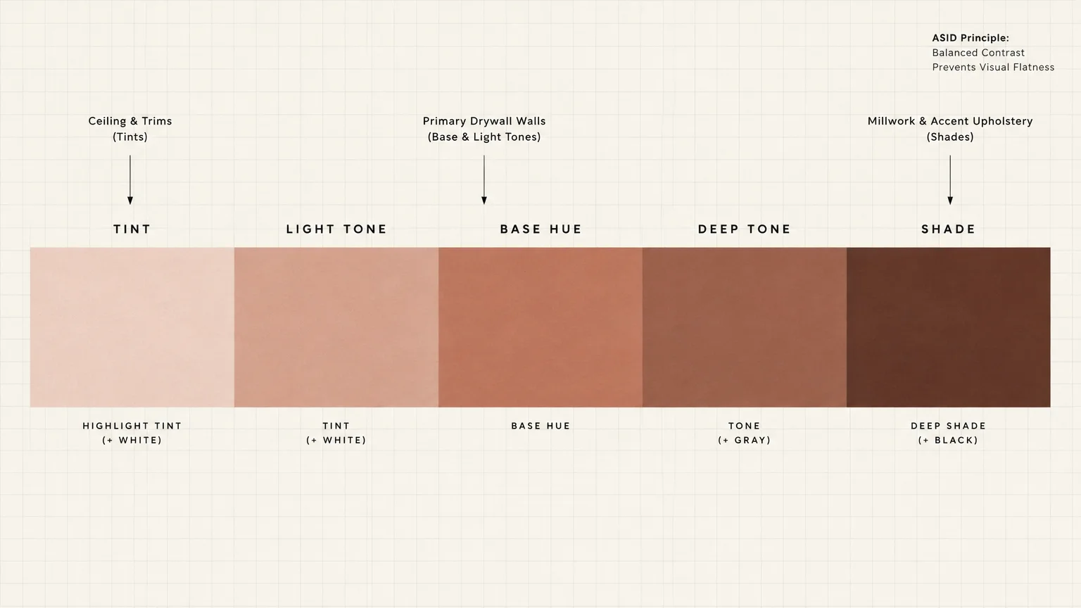
A monochromatic scheme relies on a single base color family while incorporating varied tints, tones, and shades. When executed properly, this approach produces a tailored, sophisticated atmosphere that makes architectural details stand out.
Homeowners frequently embrace tonal decor to bring visual order to busy open floor plans. The cohesive aesthetic reduces sensory clutter and makes small rooms appear significantly larger than their actual square footage.
Bedrooms, home offices, and formal dining rooms serve as premier locations for single-color styling. These spaces benefit directly from the restful ambiance and enveloping mood that unified color values deliver.
However, committing to one hue amplifies every design choice you make. Without contrasting colors to distract the eye, minor installation errors and poor planning become immediately visible.
Understanding the standard pitfalls lets you make proactive choices before buying paint, upholstery, or accent pieces. The American Society of Interior Designers emphasizes that balanced contrast forms the foundation of enduring residential interiors.
You do not need an enormous budget to create a stunning monochromatic transformation. You simply need a reliable process that balances lighting, surface textures, and color saturation.
Tools, Materials, and Prep Checklist
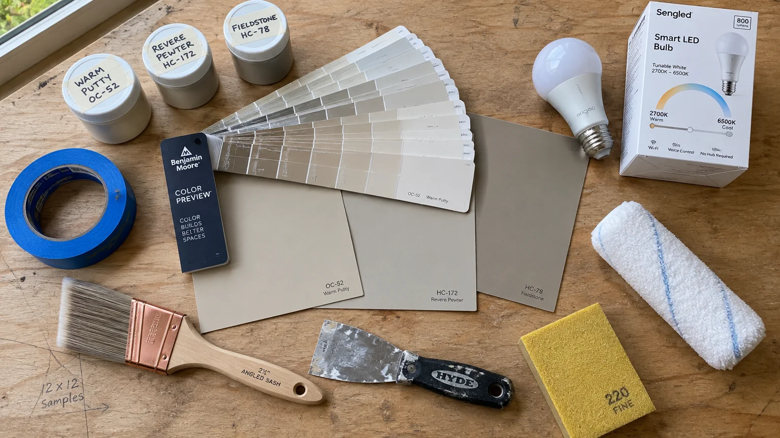
Color Evaluation Supplies: Purchase oversized peel-and-stick swatch boards rather than painting directly onto existing drywall. Collect swatch fan decks from quality manufacturers like Benjamin Moore to evaluate slight tonal shifts.
Order minimum eight-ounce sample pots for your top three paint contenders. You will also want fabric swatches of your intended drapery, rugs, and upholstery materials.
Surface Prep Essentials: Gather premium painter’s tape with edge-lock technology to create razor-sharp trim separations. Stock up on lightweight spackle, a flexible putty knife, and 220-grit sanding sponges.
Lay down canvas drop cloths across your entire work area to catch drips. Avoid thin plastic sheeting, which tears easily and presents a dangerous slipping hazard underfoot.
Application Equipment: Invest in high-density microfiber roller covers with a three-eighths-inch nap for smooth drywall surfaces. Use a two-and-a-half-inch angled sash brush for cutting cleanly into ceiling corners and baseboards.
Keep a sturdy roller tray, heavy-duty metal grid, and an adjustable extension pole nearby. These tools reduce physical strain and guarantee even paint distribution across expansive walls.
Lighting Test Tools: Acquire tunable smart LED light bulbs that adjust across the Kelvin scale. Testing your surfaces under both warm and cool color temperatures prevents unpleasant surprises after installation.
Safety Gear: Wear a NIOSH-approved respirator mask during all sanding and painting phases to avoid inhaling particulates. Put on impact-resistant safety glasses and stable, closed-toe footwear before climbing any ladder.
Step-by-Step Instructions
Phase 1: Avoid Matching Every Surface to One Flat Shade
The most frequent error in single color room design involves painting every surface the exact same paint formula. When walls, trim, doors, and furniture match identically, the room loses dimension and feels claustrophobic.
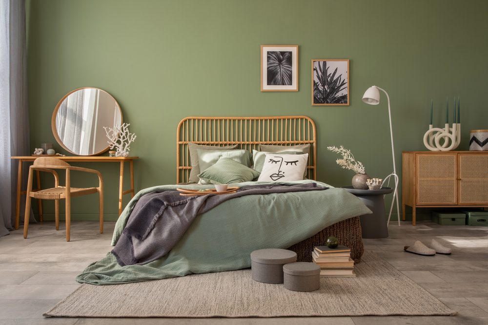
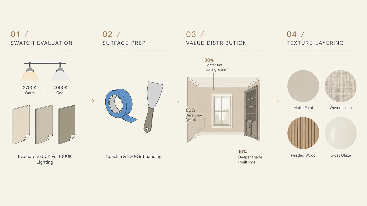
Combat this flat effect by implementing the tonal 60-30-10 distribution rule. Allocate sixty percent of the room to your mid-tone base color, typically on the primary walls.
Devote thirty percent of the space to a secondary tint that is two shades lighter or darker. Use this variation on your ceiling, large area rugs, or primary drapery panels.
Reserve the final ten percent for a deeply saturated accent shade within the same color family. Apply this rich tone to architectural trim, accent chairs, or decorative throw pillows.
Vary your paint sheens across surfaces to bounce light differently throughout the space. Coat ceilings in dead flat paint, roll walls in eggshell, and finish moldings in semi-gloss.
If your room already feels like a closed box, do not panic. Lighten your window treatments and introduce a paler rug to restore visual breathing room immediately.
Phase 2: Eliminate Flat Textures by Layering Diverse Materials
A monochromatic palette fails quickly when every material shares the same flat, smooth finish. Without contrasting hues, your eye relies entirely on physical texture to identify where one object ends and another begins.
Incorporate at least four distinct tactile surfaces within your chosen color family. Pair smooth drywall with coarse woven fabrics, ribbed ceramics, and natural grain woods.
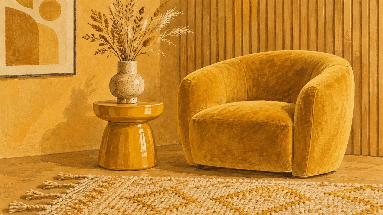
Combine a plush wool or high-pile rug with crisp linen curtains and a soft velvet sofa. The structural tension between matte, coarse, and glossy surfaces brings dynamic energy to a tonal interior design.
Mount floating shelves displaying fluted pottery, sculptural stone objects, or woven baskets. These textural elements cast micro-shadows that enrich the primary wall color.
Always anchor heavy textiles and floating shelves into wall studs using load-rated fasteners. Never rely on basic drywall anchors for items weighing over twenty pounds.
If the space feels stiff and uninviting, swap out polyester pillow covers for chunky knits or boucle textiles. Physical touch should confirm the visual depth you see across the room.
Phase 3: Prevent Murky Lighting and Shadow Traps
Monochromatic rooms absorb and reflect light in unexpected ways depending on your chosen color’s reflective value. Insufficient lighting causes deep colors to turn muddy and pale neutrals to look dreary.
Never depend on a single overhead ceiling fixture to illuminate your tonal design. Relying on one central light source creates harsh shadows that flatten your carefully layered textures.
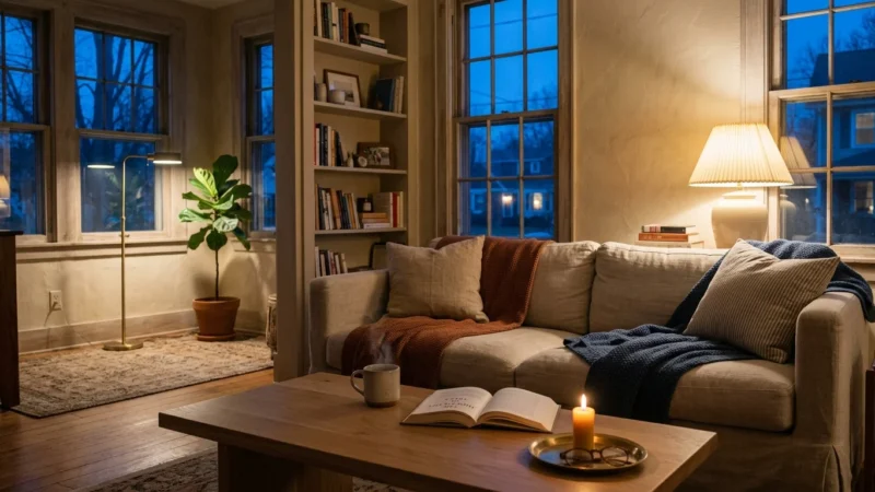
Establish three distinct lighting layers: ambient general illumination, focused task lighting, and decorative accent lights. Position table lamps, floor uplights, and wall sconces at varying heights throughout the room.
Select light bulbs with a Color Rendering Index (CRI) rating of 90 or higher. Review standards from the U.S. Department of Energy to balance bulb efficiency with accurate indoor color rendering.
Maintain consistent color temperature across all fixtures within the space. Mixing 2700K warm white bulbs with 5000K daylight bulbs creates disjointed, discolored patches on monochromatic walls.
Install digital dimmer switches on all overhead and accent circuits to modulate the room’s mood. Lowering the light levels in the evening should deepen the room’s intimacy rather than create murky corners.
If dark corners persist, mount low-profile picture lights above artwork or position an uplight behind a leafy indoor plant. These subtle fixtures illuminate recessed zones and highlight surface variations.
Phase 4: Stop Mixing Conflicting Undertones
Every color contains underlying warm, cool, or neutral pigments that dictate how it interacts with surrounding finishes. Mixing clashing undertones is among the most damaging decorating mistakes in tonal interior design.
A gray with cool blue undertones will look dirty and disjointed against a gray carrying warm taupe undertones. Similarly, a creamy yellow-white clashes violently against a crisp, cool gallery white.
Identify your primary fixture before selecting paint colors or secondary accents. If your flooring features warm reddish oak, build your palette around warm-based hues rather than icy tones.
Test all paint swatches vertically on multiple walls rather than lying flat on a table. Observe how natural morning sunlight, afternoon shadows, and artificial evening lights alter the perceived undertone.
Hold fabric samples directly against painted sample boards in natural daylight. If a fabric appears greenish, purplish, or pinkish against the paint, discard it immediately.
Consult paint manufacturer formulas at retailers like Sherwin-Williams to inspect the base colorants. Checking the tint formula reveals whether black, yellow, red, or blue dominates the mixture.
When you discover conflicting undertones after painting, adjust your light bulbs first. Switching from cool 4000K bulbs to warm 2700K bulbs often neutralizes clashing cool casts across wall surfaces.
Phase 5: Add Visual Anchors to Avoid Color Overwhelm
Designing a monochromatic room does not require banishing every secondary element from the environment. Completely erasing natural wood, metal hardware, and neutral accents leaves the space feeling clinical and artificial.
Introduce subtle contrast anchors to give the human eye a natural place to rest. These focal anchors prevent your single color room design from overwhelming visitors.
Incorporate natural wood elements through exposed furniture legs, picture frames, or decorative shelving. Warm oak, rich walnut, and pale ash provide organic relief without disrupting your tonal color story.
Select metal finishes that complement your color’s temperature to create polished visual breaks. Warm brass accents flatter deep greens and navy blues, while matte black hardware grounds pale grays and whites.
Frame artwork using crisp white or deep charcoal mats to establish defined boundaries against your walls. These boundary lines frame the art while breaking up continuous fields of wall paint.
Evaluate the room from the doorway to verify that sightlines flow smoothly across the space. If the eye wanders without finding a resting point, add a dark metal floor lamp to anchor the zone.
Know when to consult an architectural color consultant or licensed general contractor for complex spaces. If your room features vaulted ceilings or extensive wood paneling, professional guidance prevents costly paint repurchases.
Style & Finishing Touches
Tailor your monochromatic palette to match the specific function and natural light exposure of your room. South-facing rooms handle moody, saturated tones beautifully, while north-facing spaces thrive with warm, light-reflecting hues.
A warm neutral palette using shades of camel, ivory, and biscuit creates an enduring, hotel-inspired retreat. This scheme functions exceptionally well in master bedrooms where tranquil rest remains the primary goal.
Deep jewel-toned palettes like forest green, midnight navy, or charcoal create dramatic, jewel-box dining rooms and dens. Coating walls, trim, and built-in bookcases in these rich tones yields an enveloping cocoon effect.
For budget-conscious updates, spray paint existing picture frames and lamp bases in your room’s selected accent shade. This inexpensive DIY technique delivers cohesive styling without the expense of purchasing new decor.
Invest mid-range design dollars into high-touch items like architectural door hardware, drapery fabrics, and quality area rugs. These elements receive daily physical use and establish the textural richness of your design.
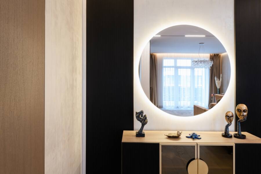
High-end upgrades include installing custom applied wall molding or vertical floor-to-ceiling tongue-and-groove paneling. Painting these three-dimensional profiles in your primary hue adds shadow lines that elevate the entire project.
Incorporate living greenery through potted fiddle-leaf figs, olive trees, or simple eucalyptus branches. Natural foliage acts as a universal neutral that breathes vitality into any monochromatic color scheme.

Maintenance & Long-Term Care
Monochromatic spaces showcase dust, scuffs, and fabric stains more readily than rooms with busy multi-colored patterns. Establishing a consistent cleaning schedule preserves the crisp, curated look of your tonal surfaces.
Dust walls, baseboards, and ceiling crown moldings monthly using an electrostatic microfiber duster on an extension pole. Removing airborne dust prevents it from settling into the micro-texture of matte and eggshell paint finishes.
Clean scuffs on painted drywall using a soft microfiber cloth dampened with warm water and mild dish detergent. Avoid aggressive scrubbing or abrasive melamine sponges, which burnish the paint and leave noticeable shiny spots.
Protect saturated fabrics and painted walls from solar damage by applying UV-blocking films to sun-drenched windows. Guidelines from the U.S. Environmental Protection Agency show that quality window treatments also improve home thermal efficiency.
Rotate seat cushions, throw pillows, and area rugs every six months to distribute wear and fading evenly. Uneven sun exposure creates obvious color discrepancies that ruin the harmony of a single-hue environment.
Store leftover paint in tightly sealed, airtight glass mason jars labeled with the room, date, and sheen. Keep these jars in a temperature-controlled pantry to ensure touch-up paint matches your walls perfectly years later.
Inspect caulked seams along baseboards, window casings, and crown moldings annually for seasonal shrinkage. Fill hairline cracks with paintable acrylic latex caulk to maintain the seamless, architectural look of your room.
FAQ
Does a monochromatic room require using only a single paint color? No, successful monochromatic design relies on multiple tints, tones, and shades within the same primary color family. Using a single identical paint formula across every surface creates a flat, lifeless environment.
What is the easiest color palette for a beginner monochromatic project? Warm neutrals, soft sages, and muted slate blues provide the most forgiving palettes for novice decorators. These hues blend seamlessly with standard wood flooring and existing furniture finishes.
Can I use wood or metal accents in a monochromatic design? Yes, natural materials and metal hardware act as essential visual anchors that prevent sensory fatigue. Select wood tones and metal finishes that share the underlying temperature of your primary palette.
How do I stop a monochromatic white or beige room from feeling clinical? Layer heavy tactile textures like bouclé, chunky wool knits, unlacquered brass, and raw light oak. Introducing warm 2700K lighting also eliminates sterile, hospital-like undertones across pale surfaces.
What paint sheen works best when coating walls, ceilings, and trim the same hue? Apply flat paint on ceilings to hide imperfections and prevent glare from overhead lighting. Use eggshell or matte on walls for durability, and finish trim and doors in satin or semi-gloss.
Takeaway & Next Steps
Designing a monochromatic interior provides an unmatched opportunity to create a tailored, tranquil living space with lasting appeal. Avoiding flat surfaces, clashing undertones, poor lighting, and textural monotony ensures your finished project looks intentionally styled.
Start your project today by collecting three paint chips from the same color swatch strip to establish your tonal range. Next, audit your existing furniture and textiles to identify which tactile materials you need to introduce.
Finally, install tunable LED bulbs in your fixtures to evaluate your chosen color swatches under varying temperatures. Taking these measured steps guarantees a rewarding transformation that elevates your entire home.
We want to see your room transformations in action! Share your finished project photos with our community, or subscribe to our newsletter for weekly home renovation tips and practical design guides.