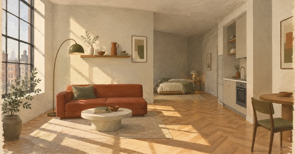
The right paint selection can visually double your square footage without knocking down a single structural wall. Crisp, high-performing hues reflect natural daylight and erase rigid room boundaries instantly.
Selecting smart paint colors for small spaces allows you to manipulate depth, shadows, and architectural sightlines. Whether you occupy an urban studio or a modest condo, tailored palettes create expansive visual breathing room.
Professional designers rely on specific formulas to make compact spaces feel grand and intentional. Discover the exact designer paint colors, prep tools, and application techniques required to transform your home on a realistic budget.
Project Overview & Why It Matters
Painting stands out as the most cost-effective home improvement project you can undertake. For under two hundred dollars, you can completely redefine how your apartment looks and functions.
Compact floor plans often suffer from restricted natural light and awkward proportions. Strategic small apartment paint colors overcome these hurdles by actively manipulating ambient light and shadow.
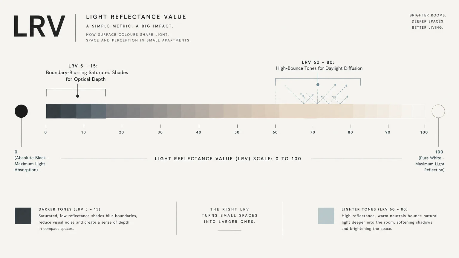
Designers evaluate the Light Reflectance Value—known as LRV—of every potential color. LRV measures the percentage of light a paint color reflects on a scale from zero to one hundred.
Colors with high LRV scores bounce daylight across living areas efficiently. Skilled decorators also know that deep shades push walls outward visually by blurring distinct room corners.
When you eliminate visual breaks between surfaces, your eyes travel freely across the entire layout. This optical continuity tricks the brain into perceiving a much larger perimeter than actually exists.

Tools, Materials, and Prep Checklist
Proper tools ensure clean edge work and prevent lap marks across tight spaces. Gathering professional gear before opening your first paint can saves you multiple hardware store runs.
Premium Paint: Buy two gallons of low-VOC interior acrylic latex paint. Budget roughly sixty to eighty dollars per gallon for professional washable formulas.
Latex Primer: Keep one gallon of stain-blocking primer ready for drywall patches or drastic transitions. A dependable gallon costs twenty-five to thirty-five dollars.
Angled Sash Brush: Invest in a two-and-a-half-inch synthetic angled brush for trim. A quality fifteen-dollar brush creates laser-sharp lines along baseboards.
Roller Setup: Secure a nine-inch roller frame with a three-eighths-inch microfiber nap. Microfiber holds ample paint and delivers a uniform finish on interior drywall.
Painter’s Tape: Acquire two rolls of multi-surface painter’s tape with edge-blocking technology. Quality tape stops bleed-through and peels cleanly away without tearing fresh paint.
Drop Cloths and Trays: Buy heavy canvas drop cloths instead of slippery plastic sheets. Add a sturdy metal tray with disposable liners for quick cleanup.
Surface Prep Essentials: Stock trisodium phosphate cleaner, spackling compound, a putty knife, and 220-grit sanding sponges. Clean, flat surfaces ensure seamless finish adhesion.
Safety Equipment: Wear safety glasses, disposable gloves, and a dust mask when sanding. Follow residential safety standards outlined by OSHA for healthy indoor air quality.
Step-by-Step Instructions
Flawless painting results hinge directly on structured execution and methodical preparation. Follow these straightforward phases to achieve a showroom finish across your small apartment.
Phase 1: Deep Wall Cleaning and Surface Prep: Clear the room or move furniture to the center under drop cloths. Wash walls with diluted trisodium phosphate to strip grease, dust, and oils.
Fill every nail hole and gouge using lightweight spackling paste. Let the patch dry completely, then sand it flush using 220-grit sandpaper.
If your apartment predates 1978, test existing layers for lead before sanding. Review lead-safe work practices established by the U.S. Environmental Protection Agency before disturbing old drywall.
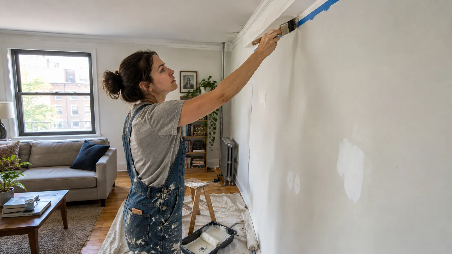
Phase 2: Surface Priming and Edge Taping: Apply painter’s tape along baseboards, window casings, and trim lines. Press tape edges down firmly using a clean putty knife to prevent paint bleed.
Spot-prime sanded patches or coat the entire wall when covering deep colors. Primer seals raw compound and ensures uniform topcoat color saturation.
Phase 3: Cutting In and Rolling Topcoats: Cut in two-inch borders around ceilings and corners using your angled brush. Work in ten-foot sections to keep a wet edge before rolling wall faces.
Dip your roller nap evenly into the tray without submerging the core. Roll walls in an overlapping “W” pattern, then smooth downward in parallel vertical passes.
Maintain even roller pressure to eliminate heavy ridges and overlap marks. Never dry-roll over partially cured sections, as doing so tears the delicate paint film.
Phase 4: Second Coat and Precision Cleanup: Let the first coat dry for four hours before rolling your second coat. Inspect the surface under bright raking light to spot thin areas.
Remove your painter’s tape while the final coat remains slightly tacky to touch. Pull the tape backward at a forty-five-degree angle for razor-sharp transitions.
Style & Finishing Touches
Designer paint colors can radically alter the perception of square footage in a small space. Professional interior designers deploy these twelve specific shades to manipulate light, expand boundaries, and infuse sophisticated style.
1. Benjamin Moore Chantilly Lace (OC-65)
Benjamin Moore Chantilly Lace is an ultra-pure white with an impressive Light Reflectance Value of 90.04. It contains virtually no warm yellow or cool blue undertones.
This pure clarity bounces daylight across shadowy studios. Designers coat walls, trim, and ceilings in Chantilly Lace to produce a seamless, boundary-free visual envelope.
2. Sherwin-Williams Alabaster (SW 7008)
Sherwin-Williams Alabaster provides a soft off-white with an LRV of 82. It delivers subtle warmth that softens stark sunlight without ever reading yellow.
In north-facing rooms with cool daylight, Alabaster supplies crucial coziness without sacrificing brightness. Pair it with matte black hardware and light oak accents for modern balance.
3. Farrow & Ball Hague Blue (No. 30)
Dark tones can create remarkable visual depth in compact quarters. Hague Blue by Farrow & Ball features rich green undertones that cause walls to visually recede.
Apply this moody shade across a small powder room or den to dissolve rigid wall corners. Deep saturated hues turn cramped rooms into intimate jewel-box spaces.
4. Benjamin Moore Pale Oak (OC-20)
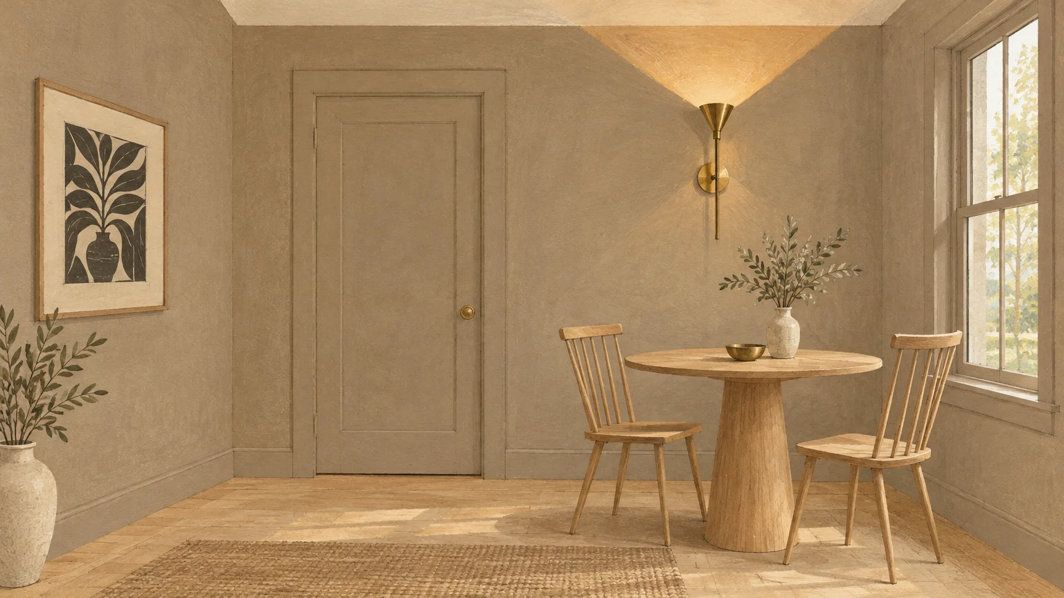
Benjamin Moore Pale Oak is an elegant greige shifting between soft gray and warm beige. With an LRV of 68.64, it adds quiet substance while keeping layouts open.
This versatile neutral harmonizes with mixed wood tones and cool stone counters. It serves as a dependable backdrop that connects open-concept living and dining zones effortlessly.
5. Sherwin-Williams Sea Salt (SW 6204)
Sherwin-Williams Sea Salt is a muted gray-green that introduces organic color into compact rooms. Its chameleon personality responds dynamically to changing natural light throughout the day.
Because cool colors visually recede, Sea Salt makes narrow bedrooms feel distinctly wider. Team this soothing shade with crisp white trim and linen textiles for effortless relaxation.
6. Farrow & Ball Skylight (No. 205)
Farrow & Ball Skylight is an ethereal pale blue with gentle gray undertones. It carries an airy optical quality that lifts tight walls and low-hanging ceilings.
Using Skylight in a compact hallway or small kitchen introduces lighthearted charm without overpowering nearby rooms. The subtle pigment softens shadows and makes compact spans feel taller.
7. Benjamin Moore Hale Navy (HC-154)
Benjamin Moore Hale Navy stands as a classic anchor for small transitional spaces. This saturated navy blue possesses balanced undertones that never appear muddy or overly harsh.
Use Hale Navy on a feature wall or entryway to establish instant visual drama. Dark accents provide contrast, making adjoining lighter spaces look significantly larger by comparison.
8. Behr Swiss Coffee (12)
Behr Swiss Coffee delivers a creamy, welcoming white that brightens compact layouts while preventing sterile chill. It softens dim rooms receiving limited natural daylight from east-facing windows.
This designer favorite bridges modern and traditional decor with effortless charm. Combine it with warm brass hardware and natural woven rugs for a relaxed, layered interior.
9. Benjamin Moore Kendall Charcoal (HC-166)
Benjamin Moore Kendall Charcoal is a grounded, rich dark gray with warm undertones. It provides substantial graphic weight without the jarring harshness of true jet black.
Designers coat compact offices and media nooks in this shade to conceal clutter. When applied from baseboard to ceiling, Kendall Charcoal envelops compact rooms in sophisticated luxury.
10. Sherwin-Williams Repose Gray (SW 7015)
Sherwin-Williams Repose Gray is a tranquil neutral featuring subtle hints of brown and purple. It reads as a true adaptable gray that stabilizes rooms with shifting sun exposures.
In apartments lacking distinct architectural zones, Repose Gray creates seamless flow from room to room. Its dependable balance makes compact spaces feel organized, cohesive, and visually expansive.
11. Farrow & Ball Setting Plaster (No. 231)
Farrow & Ball Setting Plaster is a dusty, sophisticated pink echoing traditional historic plasterwork. It contains sufficient yellow pigment to avoid looking saccharine or childish in mature spaces.
This flattering tone glows under warm interior lighting, lending small spaces an inviting radiance. Pair it with deep olive greens or blackened bronze fixtures for upscale architectural contrast.
12. Farrow & Ball Green Smoke (No. 47)
Farrow & Ball Green Smoke is a smoky, muted blue-green hue evoking timeless interiors. Its weathered, earthy presence imparts immense depth and tranquil serenity to compact spaces.
Covering small dining corners or bedrooms in Green Smoke brings the calming outdoors inside. The hue absorbs harsh edges, visually expanding wall limits and establishing a serene ambiance.
Designer Techniques for Spatial Expansion
Consider the color drenching technique to eliminate distracting visual interruptions. Paint your walls, baseboards, door frames, and heating radiators in the exact same hue and sheen.
When trim matches the wall color, your visual field expands from floor to ceiling uninterrupted. This seamless continuity helps make small rooms look bigger and declutters compact floor plans.
If you prefer white ceilings, choose an ultra-flat white paint with a higher LRV than your walls. High-reflectance ceilings draw the eye upward and simulate higher overhead clearance.
You can also explore apartment paint ideas that incorporate semi-gloss finishes on vertical trim and doors. Glossy details act as light reflectors, adding subtle dimension without cluttering your physical layout.
Maintenance & Long-Term Care
Small apartments experience elevated wear because living activities concentrate in compact circulation paths. Establishing a simple maintenance routine protects your walls from daily scuffs and finger marks.
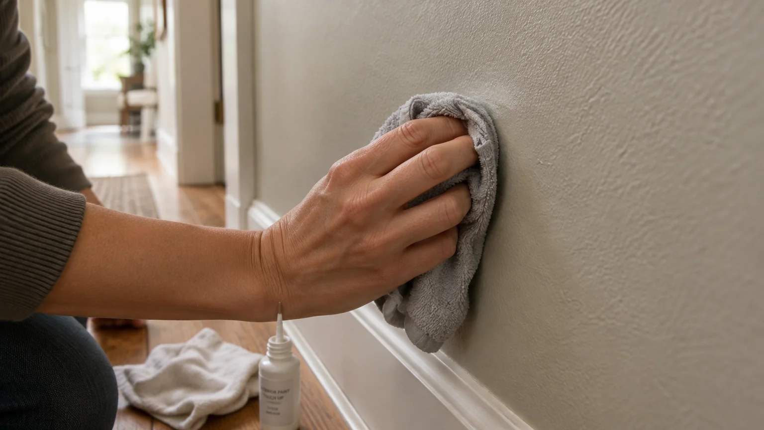
Clean painted walls using a soft microfiber cloth dampened with warm water and mild dish soap. Avoid abrasive scouring pads, which burnish sheens and ruin the finish.
Tackle scuff marks immediately using specialized melamine foam erasers with gentle circular pressure. Test the eraser on an inconspicuous spot first to verify it preserves paint sheen.
Store leftover paint in airtight glass mason jars labeled with the color name, brand, and date. Keep jars in a temperature-controlled closet away from freezing temperatures or humid bathrooms.
When performing touch-ups, feather the paint outward from the center using a small foam brush. Feathering blends the repair into the surrounding cured paint, avoiding noticeable patches.
FAQ
What paint sheen works best in small apartments?
An eggshell or satin finish works best on walls in small spaces. These sheens balance gentle light reflection with scrubbable durability, making them ideal for high-traffic compact rooms.
Use flat paint on ceilings to conceal surface imperfections without producing glare. Use semi-gloss on trim and baseboards for maximum stain resistance and effortless cleaning.
Can dark paint colors really make a small space look bigger?
Yes, deep saturated paint colors can make small spaces appear larger by blurring hard perimeter boundaries. Dark hues recede from view, tricking your eye into perceiving infinite depth.
This technique works best in spaces with limited natural light, like powder rooms, hallways, and cozy bedrooms. Embrace the darkness rather than trying to force brightness into windowless areas.
Should ceilings always be painted white in small rooms?
Not necessarily, though bright white ceilings certainly reflect ambient light downward effectively. Painting the ceiling the same color as the walls creates a seamless envelope that erases visible room edges.
In rooms with tall ceilings, a darker overhead tone can create cozy intimacy and distinct character. In standard eight-foot rooms, matching ceiling paint to walls prevents harsh horizontal dividing lines.
How many paint colors should you use in a small apartment?
Stick to a tight palette of three to four cohesive colors across your entire apartment. Limiting your palette ensures smooth visual flow between adjoining rooms and prevents chaotic sensory overload.
Select one dominant wall color, one complementary trim color, and one or two grounded accent shades. This disciplined approach unites your entire floor plan into a single harmonious space.
How do you test paint samples accurately before committing?
Never paint sample swatches directly onto the wall without an underlying white primer base. Instead, paint large peel-and-stick boards or poster boards with two coats of each sample shade.
Move the sample boards around your rooms at different times of day to evaluate changing lighting conditions. Check how the undertones look in morning light, afternoon sun, and under evening lamps.
Takeaway & Next Steps
Mastering small apartment paint colors unlocks high-end designer aesthetics without demanding major renovation expenses. Strategic color selection and proper application transform cramped quarters into spacious, inviting sanctuaries.
Transform your living space today by taking these three immediate actionable steps:
Step 1: Measure your room’s square footage and calculate how many gallons of premium paint you need.
Step 2: Order large peel-and-stick color samples of your top three designer shades to examine undertones.
Step 3: Gather your prep supplies, patch wall imperfections, and schedule your weekend painting session.
Have you transformed a compact space with one of these designer paint colors? Share your before-and-after photos with our community, or subscribe to our newsletter for weekly home improvement guides.