Low ceilings can make any living area feel confined, dark, and cramped. Strategic wall paint offers an immediate visual solution that stretches vertical boundaries without structural demolition.
By pairing specific undertones with proven ceiling paint tricks, you draw the eye upward and expand the perceived height of your room. These targeted selections help wall colors small rooms require perform at their highest level.
Discover the best paint colors high ceilings demand, along with practical interior design tips that transform your living environment on a realistic weekend budget.
Project Overview & Why It Matters
Standard eight-foot ceilings often make modern living areas feel boxy and uninspiring. Vertical proportions dictate how open, clean, and welcoming your home feels to your family and guests.
You do not need to tackle messy structural alterations to elevate your home. Applying intentional color theory alters how light travels across your drywall, creating an immediate optical lift.
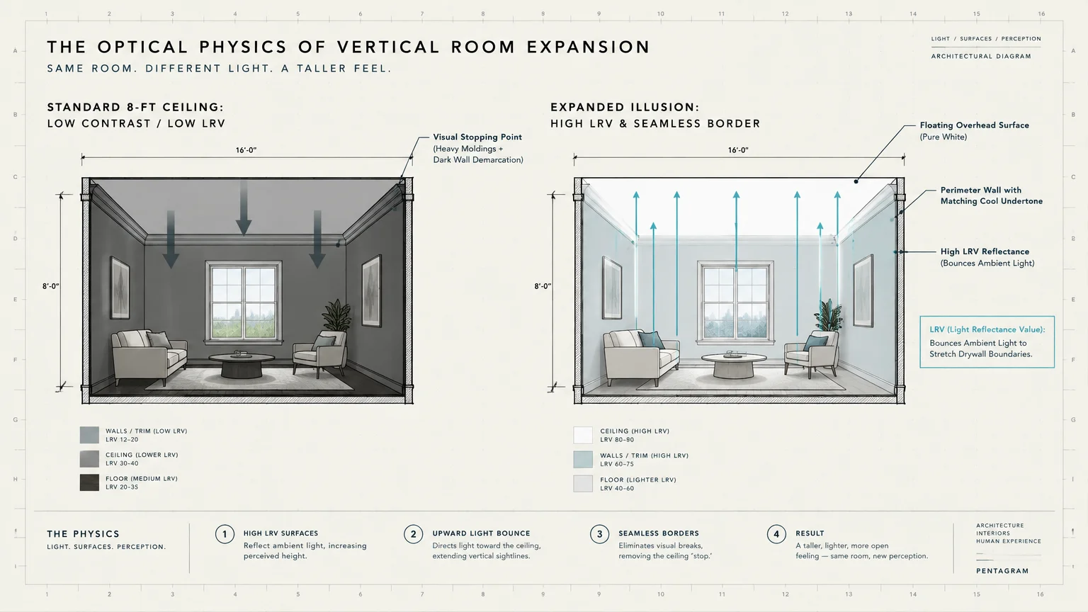
The underlying science revolves around Light Reflectance Value, commonly abbreviated as LRV. Paints rated with higher LRV numbers bounce substantial ambient light, pushing perimeter walls outward and upward.
Contrast also plays a defining role in spatial perception. When you minimize the visual border between walls and overhead drywall, you eliminate the visual stopping points that shorten rooms.
Conversely, pairing deep, saturated hues with bright white overhead surfaces creates an expansive backdrop. That sharp contrast makes your upper boundary appear to float higher than its physical location.
Selecting the right wall color delivers major aesthetic benefits without draining your renovation fund. A few well-chosen gallons of paint can completely redefine the spatial balance of your home.
Tools, Materials, and Prep Checklist
Gathering professional-grade tools ensures crisp edges and smooth coverage across every wall surface. Quality equipment prevents costly application mistakes and reduces physical fatigue during your project.
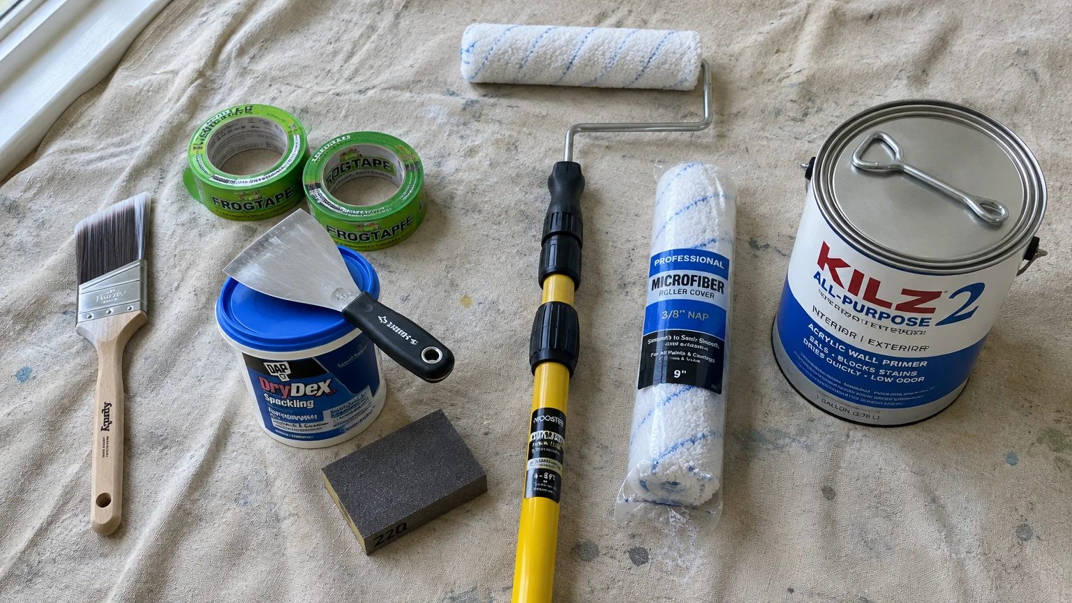
High-Density Roller Covers: Purchase two three-eighths-inch nap microfiber roller covers. These hold ample paint and deliver a uniform texture without unsightly stippling.
Angled Sash Brush: Select a two-and-a-half-inch polyester-nylon blend brush for precise cutting along ceilings and baseboards. Premium brushes prevent bristle loss and maintain razor-sharp paint lines.
Telescoping Extension Pole: Use an adjustable four-to-eight-foot fiberglass pole. An extension pole keeps your feet safely on the floor while maintaining continuous, uninterrupted roller strokes.
Premium Painter’s Tape: Invest in two rolls of multi-surface painter’s tape featuring edge-lock technology. Quality tape stops paint bleed along ceiling perimeters and delicate woodwork.
Canvas Drop Cloths: Choose heavy canvas cloths rather than thin plastic sheeting. Canvas stays firmly in place, absorbs stray drips, and prevents dangerous slipping hazards while you work.
Drywall Compound and Putty Knife: Keep lightweight spackle and a four-inch flexible blade on hand. Smooth wall surfaces reflect light evenly, preventing shadows that exaggerate low clearances.
Fine Sanding Sponge: Use a 220-grit sponge to feather out patched imperfections before priming. Uniform wall texture prevents patchy sheen differences that catch harsh overhead glare.
Dedicated Wall Primer: Apply one gallon of stain-blocking acrylic primer over patched drywall or bold previous colors. Primer ensures true color reproduction and maximizes the paint’s Light Reflectance Value.
10 Wall Colors That Make Ceilings Look Higher
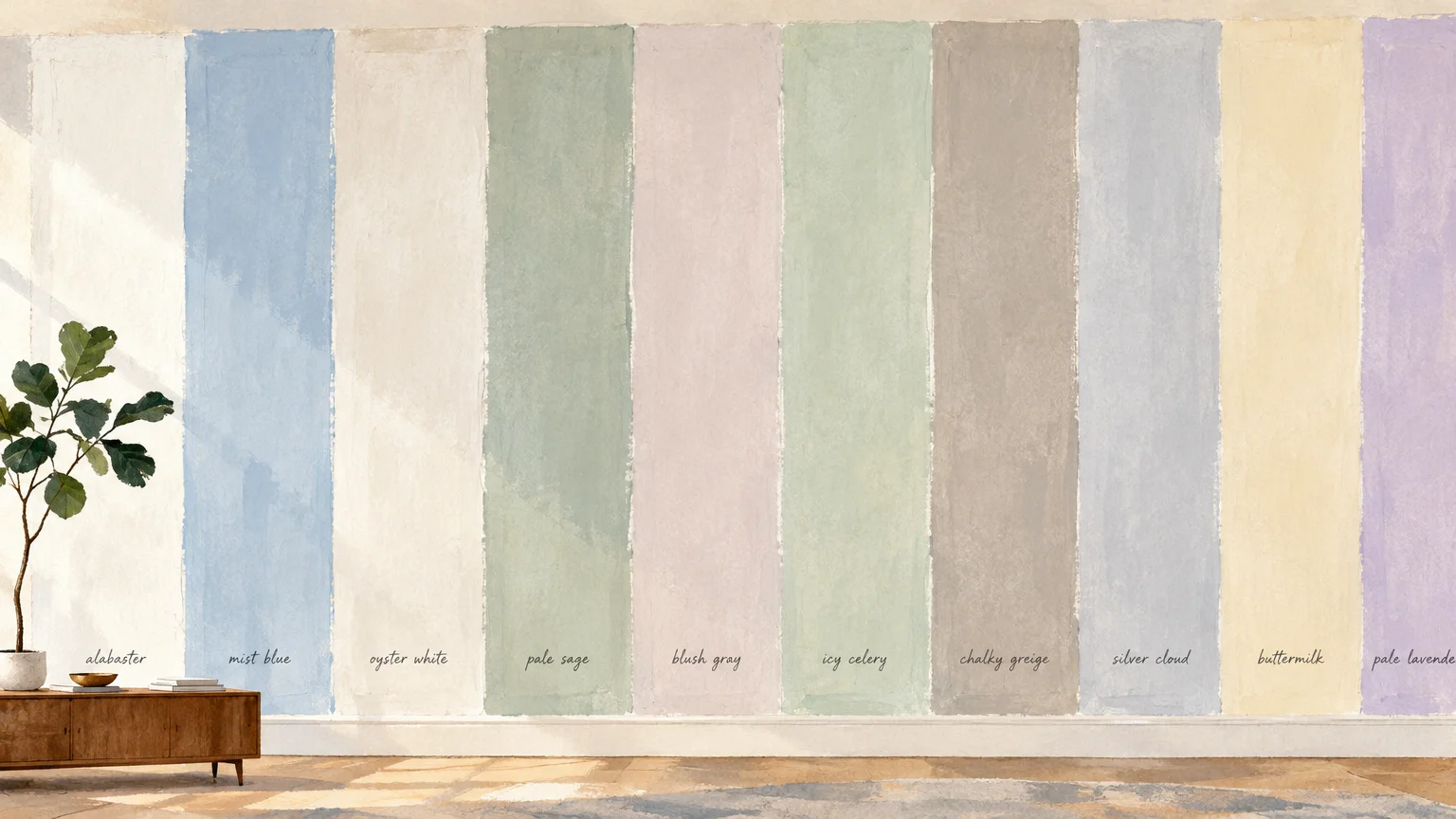
The following carefully selected paint colors leverage light reflection, atmospheric depth, and visual contrast. Each shade works strategically to make ceilings look higher across diverse residential layouts.
1. Warm Alabaster White
Warm alabaster white contains subtle yellow and beige undertones that eliminate cold, sterile glares. It reflects maximum daylight while preserving a cozy, welcoming ambiance across your living spaces.
When applied to walls, alabaster creates seamless transitions toward flat white ceiling paint. This minimal contrast blurs the boundary line, drawing your gaze upward without visual interruption.
Renowned paint brands like Sherwin-Williams offer balanced alabaster formulas that brighten small spaces reliably. Use an eggshell finish on walls to bounce light while masking minor drywall flaws.
2. Pale Sky Blue
Pale sky blue draws inspiration from the natural outdoor horizon. Human psychology associates soft blue tones with infinite vertical clearance and open atmospheric skies.
This soothing hue softens wall edges and tricks your brain into perceiving unbounded space overhead. It works exceptionally well in bedrooms, sunrooms, and windowless hallways that feel cramped.
Pair pale blue walls with an ultra-flat pure white ceiling for the strongest aerial effect. The crisp upper contrast mimics clouds drifting across an endless sunny afternoon.
3. Muted Sage Green
Muted sage green introduces organic tranquility without weighing down your interior proportions. Its gentle gray undertone prevents the green from overwhelming compact spaces.
Light sage recedes from the viewer’s peripheral vision, pushing your walls outward in every direction. That outward expansion naturally emphasizes the vertical distance between the floor and ceiling.
Complement soft sage with satin white baseboards and an un-tinted white ceiling. The fresh botanical palette draws natural lighting inward and creates an airy, spacious sanctuary.
4. Cool Mist Gray
Cool mist gray features faint blue and slate undertones that make vertical surfaces appear farther away. Warm grays advance forward, while cool tones recede, expanding perceived room volume.
This shade serves as a versatile neutral foundation for contemporary and transitional home styles. It distributes window light smoothly without producing distracting hot spots or heavy shadows.
Keep your trim and ceiling painted in matching cool white tones. This uniform cool temperature removes rigid breaks, encouraging eyes to travel freely toward the ceiling.
5. Delicate Blush Pink
Delicate blush pink functions as an inventive, warm neutral that infuses rooms with soft radiance. Modern blush colors contain subtle beige undertones that avoid looking juvenile or overly sweet.
Blush reflects warm, flattering illumination upward toward your ceiling panels. That upward illumination bounce lifts overhead shadows, making low basements and dim bedrooms feel significantly taller.
Pair delicate blush walls with clean, warm white trim for an elegant, tailored presentation. The gentle contrast defines architectural lines without abruptly cutting off vertical visual flow.
6. Soft Creamy Greige
Greige expertly marries the modern feel of gray with the inviting warmth of classic beige. A high-LRV greige reflects ample illumination while keeping living spaces grounded and comfortable.
This adaptable shade minimizes dramatic shadow lines where walls intersect with upper drywall. Eliminating those harsh visual breaks makes the ceiling plane feel like a natural, elevated extension.
Leading paint manufacturers like Benjamin Moore formulate balanced greiges that adapt effortlessly to fluctuating daylight. Greige remains one of the safest investments for whole-house consistency.
7. Deep Midnight Navy
While light colors expand space through reflection, deep midnight navy utilizes dramatic contrast to achieve height. Dark walls recede into shadow, blurring the precise corners of the room.
When you top midnight navy walls with a brilliant white ceiling, the ceiling appears to float. This stark tonal shift creates the optical illusion of soaring, detached overhead height.
Apply navy in spaces featuring decent natural light or intentional architectural sconces. The moody contrast delivers undeniable elegance while delivering surprising vertical impact.
8. Whispering Lavender
Whispering lavender incorporates smoky violet undertones that yield remarkable aerial depth. Like pale sky blue, soft violet hues mimic atmospheric distance found in natural outdoor landscapes.
This color deflects harsh glares and diffuses soft lighting evenly across your walls. The subtle tint provides just enough color presence to contrast cleanly against bright overhead plaster.
Use whispering lavender in compact guest bedrooms, home offices, or half bathrooms. It adds artistic sophistication while keeping your vertical sightlines open, expansive, and unrestricted.
9. Charcoal Slate
Charcoal slate delivers an upscale, dramatic atmosphere that modern interior designers frequently employ. Far from shrinking a room, deep charcoal softens corner junctions by absorbing ambient shadows.
Pairing charcoal slate with high-gloss white crown molding and a flat white ceiling accentuates vertical lines. The stark juxtaposition immediately draws attention upward toward the brightest plane.
Ensure you install sufficient warm-temperature artificial lighting when applying dark slate shades. Strategic lighting keeps the space feeling luxurious and expansive rather than cavernous or somber.
10. Seafoam Aqua
Seafoam aqua blends the expansive qualities of crisp blue with the rejuvenating serenity of green. Its luminous undertone captures sunlight and spreads it generously across the entire room.
This shade pushes perimeter walls outward and creates a refreshing, breezy coastal feeling. The airy quality naturally makes standard eight-foot ceilings feel significantly less confining.
Combine seafoam aqua with bright white ceiling finishes and light wood accents. The bright reflective envelope lifts visual weight from overhead framing, maximizing vertical volume.
Step-by-Step Instructions
Executing a flawless paint job requires methodical preparation and disciplined application techniques. Follow these clear phases to maximize the height-enhancing benefits of your selected wall colors.
Phase 1: Surface Preparation and Cleaning
Begin by moving furniture to the center of the room and covering floors with canvas cloths. Remove all outlet covers, switch plates, and window hardware before starting your work.
Wash walls with a mixture of warm water and mild dish detergent to remove grease and dust. Clean drywall ensures strong paint adhesion and prevents unsightly peeling along upper trim lines.
Inspect surfaces for nail holes or gouges, filling any imperfections with lightweight drywall spackle. Sand the patched spots flush with a 220-grit sponge once the compound fully cures.
Vacuum away sanding residue and wipe the baseboards with a tack cloth. Clean surfaces guarantee that painter’s tape adheres tightly without allowing paint bleed beneath the edge.
Phase 2: Cutting In with Precision
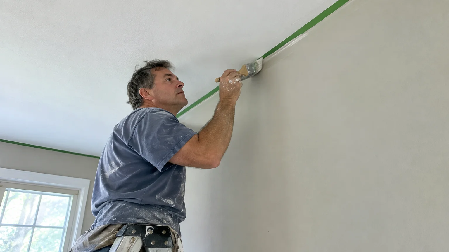
Apply painter’s tape along the ceiling perimeter if you lack a steady hand for freehand cutting. Press the tape edge firmly with a flexible putty knife to establish a watertight seal.
Dip your angled brush one-third into the paint, gently tapping excess coating against the inner can rim. Avoid wiping bristles against the lip, which strips necessary paint load from the tip.
Cut in a three-inch band along the ceiling junction, working in manageable four-foot sections. Maintain a wet edge to blend your brush strokes seamlessly with subsequent roller passes.
Phase 3: Rolling Walls for Smooth Coverage
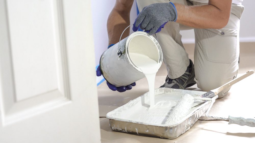
Pour your wall paint into a sturdy roller tray fitted with a disposable liner. Thoroughly saturate the microfiber roller cover by rolling it across the tray’s textured ramp.
Apply the paint to your wall in an upward “W” pattern, covering an approximate four-foot square area. Fill in the pattern with continuous vertical strokes to lay down an even coat.
Always finish rolling in a single downward direction before moving to the adjacent wall section. This uniform tipping-off technique aligns paint stippling, ensuring optimal light reflection across the drywall.
Phase 4: The Upper Border Trick
To make ceilings look higher, consider extending wall paint an inch onto the ceiling perimeter. Alternatively, bring the ceiling color down two inches onto the top edge of your walls.
Bringing ceiling white down the wall tricks the eye into believing the ceiling begins earlier. Use a laser level and sharp tape to create a razor-sharp, professional horizontal line.
Safety and Professional Callouts
Prioritize personal safety whenever working at elevated heights on ladders or step stools. Review guidelines from the Occupational Safety and Health Administration regarding secure three-point ladder contact.
Maintain adequate cross-ventilation by opening windows and running box fans while painting indoors. Proper airflow accelerates curing times and prevents headaches caused by chemical vapor accumulation.
If your home dates before 1978, test existing layers for toxic lead paint before dry sanding. Follow lead-safe work practices mandated by the Environmental Protection Agency to protect your family’s health.
Hire a licensed, insured painting contractor if your room features vaulted sections exceeding twelve feet. High stairwells and complex angles present genuine fall risks best managed by seasoned professionals.
Style & Finishing Touches
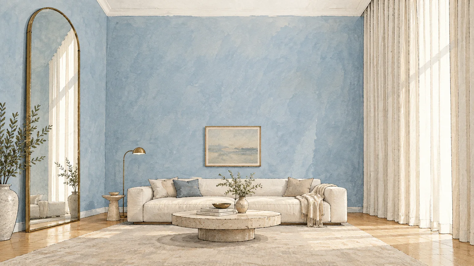
Paint color establishes the spatial foundation, but complementary interior design tips complete the vertical transformation. Integrate these smart styling upgrades to maximize your room’s vertical potential.
Install your drapery rods directly below the ceiling drywall rather than at window frames. Hanging full-length curtains that graze the floor creates powerful vertical lines that elongate walls dramatically.
Keep crown molding slim or paint it the exact same color as your walls. Bulky, contrasting moldings act like a picture frame, visually dropping the ceiling downward into the room.
Incorporate directional lighting that bounces light upward toward upper drywall surfaces. Up-lighting fixtures wash the ceiling in soft illumination, banishing dim corners that make rooms feel claustrophobic.
Select low-profile furniture pieces with clean horizontal silhouettes to exaggerate vertical clearance above. Leaving ample air space between sofa backs and the ceiling enhances the room’s open feeling.
Hang vertical artwork or lean tall floor mirrors against your primary focal walls. Tall rectangular frames draw eyes continuously upward, reinforcing the airy illusion established by your new paint.
Maintenance & Long-Term Care
Maintaining pristine wall surfaces preserves the light-reflecting qualities that keep your ceilings looking elevated. Over time, scuffs and airborne dust absorb ambient light, flattening the room’s perceived volume.
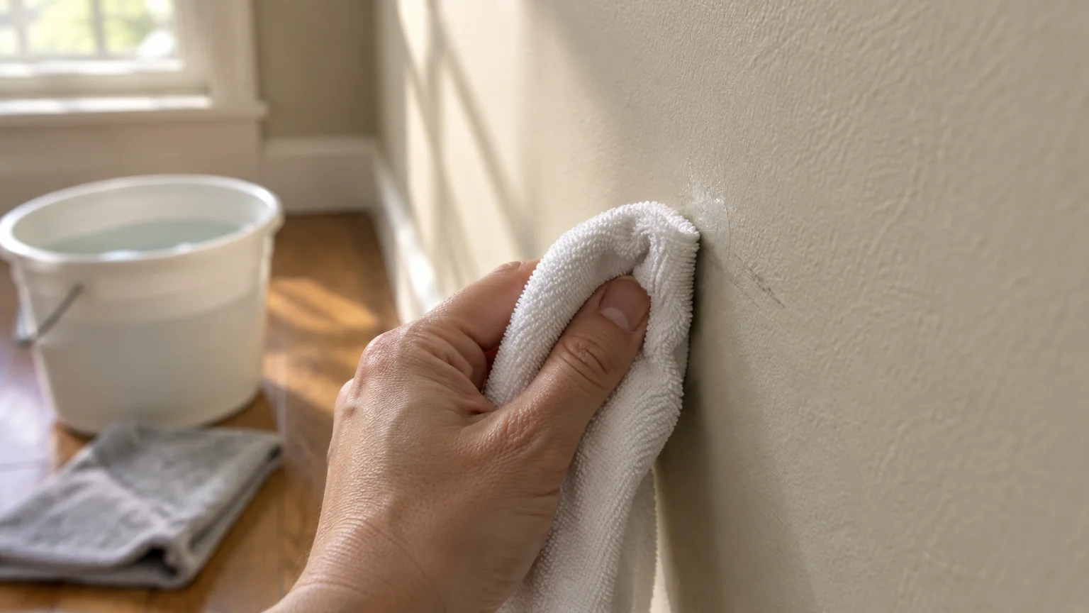
Clean dirty fingerprints and smudges using a soft microfiber cloth dampened with mild soapy water. Avoid abrasive scrub pads, which burnish eggshell finishes and create permanent shiny spots on drywall.
Inspect ceiling corners annually for seasonal hairline settling cracks along the taped joints. Small cracks disrupt the clean boundary line, drawing unwanted attention to physical height restrictions.
Repair minor drywall shifting using paintable acrylic caulk or flexible elastomeric patching compound. Feather the patch carefully and touch up using an artist brush and leftover original wall paint.
Store leftover paint in tightly sealed metal cans stored in climate-controlled areas away from frost. Properly preserved paint allows you to perform seamless scuff touch-ups for years to come.
FAQ
Should ceiling paint always be lighter than wall paint? In most homes, ceiling paint should be several shades lighter than walls to maximize vertical reflection. Alternatively, pairing dark walls with bright white ceilings creates dramatic height through sharp visual contrast.
What sheen works best to make ceilings look higher? Flat or ultra-flat sheens perform best on ceilings because they absorb harsh reflections and mask surface imperfections. Use eggshell on walls to bounce ambient light upward without highlighting drywall joints.
Can dark paint colors really make a low ceiling look taller? Deep shades like midnight navy or charcoal slate blur corner perimeters into shadow. When paired with a crisp white ceiling, the upper boundary appears to float noticeably higher overhead.
How should I paint crown molding in a low-ceiling room? Paint your crown molding the exact same shade and sheen as your walls. This prevents an abrupt horizontal break, allowing your gaze to travel uninterrupted to the ceiling edge.
Is primer required when using paint colors high ceilings need? Primer is vital when transitioning between drastically different color values or covering patched drywall areas. A uniform base coat prevents flashing and ensures your finish coat delivers maximum Light Reflectance Value.
Takeaway & Next Steps
Altering perceived ceiling height does not require expensive remodeling or intrusive structural renovations. Intentional wall colors and smart application methods transform cramped spaces into bright, expansive environments effortlessly.
Action 1: Measure your room’s square footage and calculate necessary paint volume using trusted manufacturer calculators.
Action 2: Purchase sample pots of three top shades and paint two-foot test swatches along your highest wall.
Action 3: Gather high-density rollers, quality painter’s tape, and an extension pole before starting weekend prep.
Have you transformed a low-ceiling space using one of these ceiling paint tricks? Share your project photos with our community or subscribe to our weekly newsletter for more practical home improvement tips!