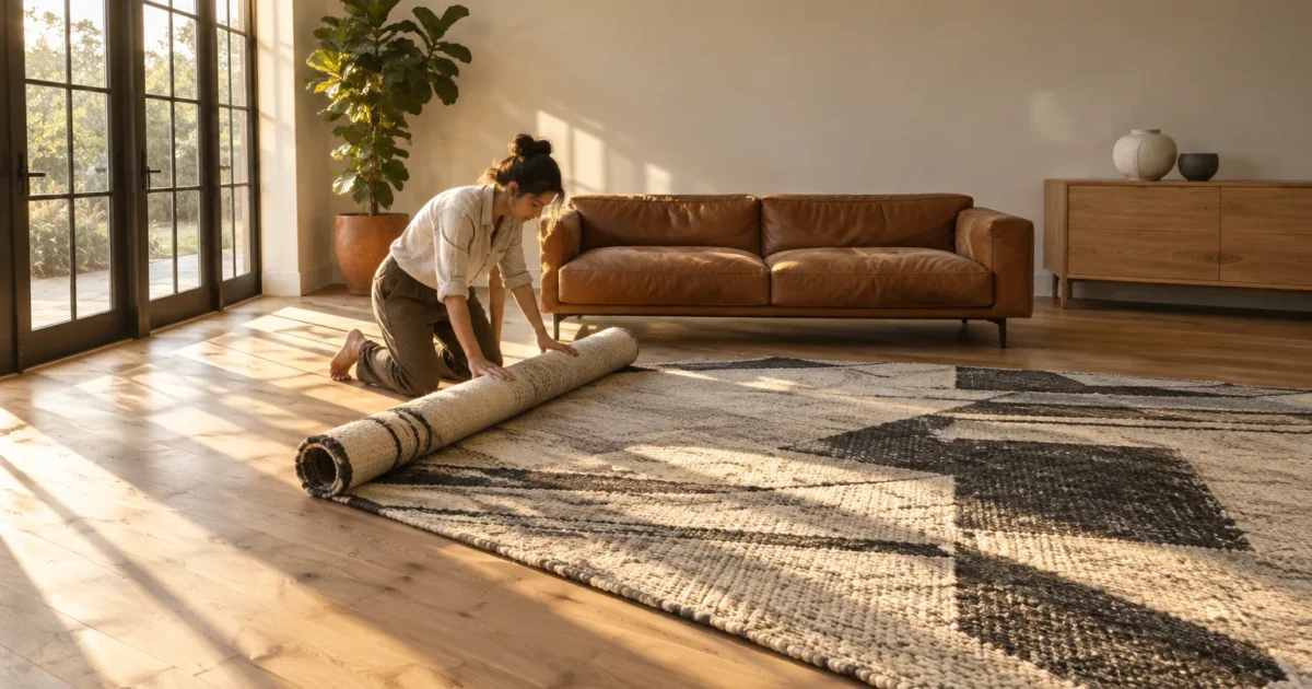
You can transform a cramped room into an airy, organized retreat by correcting a few simple decorating choices. Eliminating visual noise immediately frees up square footage and restores everyday comfort.
Most homeowners do not lack actual square footage; rather, they struggle with scale, lighting, and furniture placement. Fixing these common decorating mistakes will instantly improve flow and functionality across your home.
This guide delivers practical interior design tips to help you declutter home decor without remodeling. You will learn how to make a room feel bigger while preserving your personal style.
Project Overview & Why It Matters
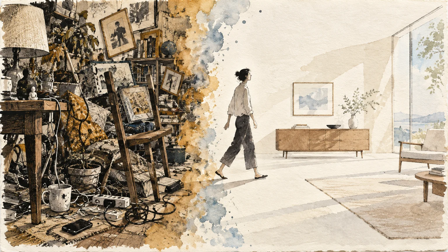
Visual clutter creates subconscious mental fatigue and restricts physical movement throughout your living spaces. When you arrange decor incorrectly, your brain registers every disjointed item as an obstacle.
Correcting cluttered room decor mistakes allows natural light to circulate freely across floors and walls. A well-proportioned layout establishes an inviting atmosphere that highlights your favorite possessions.
Proper spatial planning also prevents tripping hazards and supports household safety. Maintaining open pathways protects children and guests while keeping your delicate furnishings safe from accidental bumps.
These adjustments yield dramatic visual improvements on a modest weekend budget. You do not need expensive structural renovations to achieve a clean, professional aesthetic.
Tools, Materials, and Prep Checklist
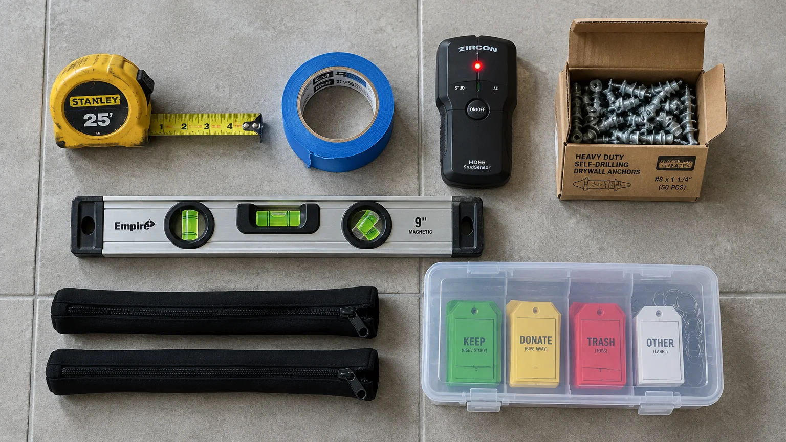
Before rearranging your furnishings, gather a few reliable tools to ensure accurate measurements and safe installations. Having these supplies on hand keeps your project organized and efficient.
25-Foot Steel Tape Measure: Pick up a standard tape measure for approximately $10 at The Home Depot. Accurate measurements prevent proportion errors before you buy furniture.
Blue Painter’s Tape: A roll costs around $6 and helps you map out furniture footprints directly on your flooring. This prep step prevents costly purchasing blunders.
Digital Stud Finder: Invest $20 to $30 in a quality sensor to locate framing studs. Securing heavy wall decor into solid wood prevents wall damage and personal injuries.
Magnetic Torpedo Level: A 9-inch torpedo level costs about $12 at local hardware stores. Keeping wall art and shelving perfectly plumb stops visual tilting that reads as clutter.
Heavy-Duty Wall Anchors: Pick up a multi-pack of self-drilling drywall anchors for $15. Rated anchors support floating shelves and mirrors where wood studs are unavailable.
Cord Management Sleeves: Flexible neoprene sleeves cost roughly $12 per pack on Amazon. Bundling loose electronic wires instantly removes floor distractions.
Stackable Storage Totes: Clear plastic storage bins run about $8 each. Label bins for donation, relocation, or disposal before you move decor items.
Step-by-Step Instructions
Resolving spatial chaos requires tackling design flaws systematically across your home. Follow these targeted steps to fix the ten most pervasive decorating errors.
Phase 1: Correcting Scale and Furniture Placement
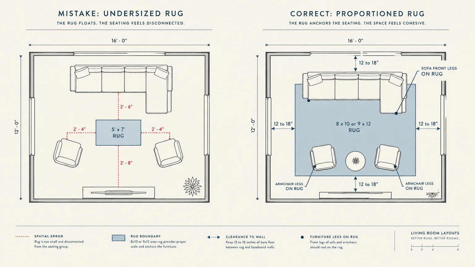
Mistake 1: Choosing Undersized Area Rugs. A postage-stamp rug floats awkwardly and makes living room seating look congested. It chops up your floor plan visually and shrinks perceived room boundaries.
Position your rug so that at least the front legs of all major seating pieces rest securely on it. In standard living rooms, an 8-by-10-foot or 9-by-12-foot rug delivers balanced proportions.
Maintain 12 to 18 inches of bare floor between the rug edges and your baseboards. This framing creates an intentional border that visually expands boundaries.
Mistake 2: Pushing All Furniture Flat Against Walls. Homeowners often shove sofas against the perimeter believing it opens floor area. In reality, this layout creates an awkward dead zone that emphasizes edge clutter.
Float your primary seating inward by several inches to create an intimate conversation grouping. Ground the arrangement with a coffee table positioned 14 to 18 inches away from the sofa.
Maintain primary walkway clearances of 30 to 36 inches around the floating furniture. This guarantees comfortable circulation without creating traffic bottlenecks.
Mistake 3: Overwhelming Proportions and Bulky Silhouettes. Heavy, overstuffed recliners and monolithic credenzas absorb light and choke small rooms. Dense furniture profiles block sightlines and make spaces feel overcrowded.
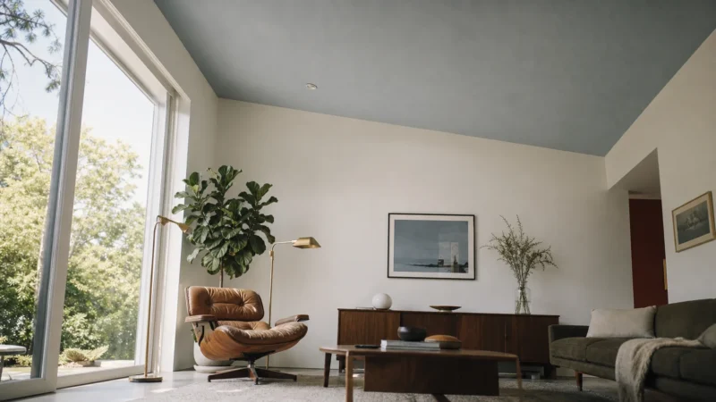
Select furniture with exposed legs to let ambient light pass underneath the frames. Leggy mid-century armchairs or slim metal consoles increase visible floor space instantly.
Balance solid pieces with transparent or reflective elements like glass-topped coffee tables. Seeing continuous flooring beneath furniture fools the eye into perceiving greater depth.
Phase 2: Editing Wall Decor and Surface Vignettes
Mistake 4: Hanging Artwork at the Wrong Elevation. Art mounted too close to the ceiling makes walls feel top-heavy and disconnected from your furnishings. Art hung haphazardly creates visual chaos across your sightlines.
Hang single art pieces so their center point sits 57 to 60 inches above the finished floor. This standard gallery measurement aligns decor with natural human eye levels.
When mounting art above a sofa or headboard, leave 6 to 8 inches of space between the furniture top and frame bottom. This grouping ties pieces together into a unified visual unit.
Safety Callout: Secure frames heavier than 20 pounds directly into wall studs. If studs are unavailable, use toggle bolts rated for double the frame weight to prevent falls.
Mistake 5: Scattering Small Knickknacks Across Every Surface. Distributing dozens of tiny trinkets across tables and mantels produces jarring visual static. Your eyes bounce frantically from item to item without finding a restful focal point.
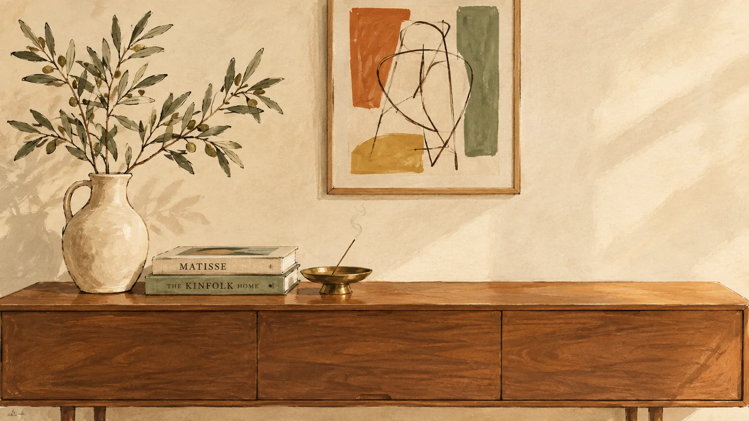
Group decorative items using the designer rule of three, combining varied heights and textures. Place a tall ceramic vase next to a medium candle and a low decorative bowl.
Corral these clusters on decorative trays to create defined boundaries for your accents. A tray establishes a clean perimeter that reads as a single curated vignette.
Mistake 6: Neglecting Minimum Walkway Clearances. Squeezing side tables and accent chairs into narrow pathways compromises room function. When you must shimmy sideways between pieces, your home instantly feels overstuffed.
Leave a minimum of 36 inches for main entryways and high-traffic pathways according to standards from the American Society of Interior Designers. Secondary pathways can tighten slightly to 30 inches.
Use painter’s tape on the floor to outline potential furniture footprints before buying. Walk the mapped layout for an entire day to verify natural traffic flow.
Phase 3: Upgrading Lighting and Window Treatments
Mistake 7: Relying Exclusively on Overhead Lighting. A single ceiling fixture casts harsh shadows into corners and flattens room depth. Dim, shadowy corners visually shrink your perimeter and make items look messy.
Implement layered lighting by pairing ambient ceiling fixtures with task and accent lamps. Position table lamps and floor lamps at varying elevations to illuminate dark corners.
Install 2700K to 3000K warm white LED bulbs to maintain a welcoming glow. Consistent color temperatures eliminate competing light casts that disjoint the room.
Mistake 8: Hanging Curtains Too Low and Narrow. Mounting curtain rods right along the window frame truncates wall height. Thick curtain panels that cover window glass also block daylight, compounding feelings of enclosure.
Mount your curtain hardware 4 to 6 inches above the window trim or near the ceiling line. Extend the rod 8 to 12 inches past the frame on each side.
This placement allows curtain panels to rest on the wall rather than covering glass when opened. Your windows appear substantially larger while flooding the space with natural light.
Phase 4: Streamlining Shelving and Cable Management
Mistake 9: Overloading Open Shelving Displays. Filling every cubic inch of open bookcase shelving creates overwhelming visual clutter. Bookcases packed with mismatched paperback spines and knickknacks dominate the entire room.
Follow the one-third styling guideline by dedicating one-third of shelf space to books. Reserve one-third for decorative objects and leave the final third completely empty.
Safety Callout: Anchor all tall shelving units over 27 inches high to wall studs using anti-tip brackets. Review child safety guidance from the U.S. Consumer Product Safety Commission to prevent tip-over accidents.
Mistake 10: Leaving Electronic Cords and Cables Exposed. Tangled nests of entertainment cables, phone chargers, and lamp cords instantly ruin clean design. Black wiring snaking across light baseboards draws the eye straight downward.
Route electrical cables through paintable wall raceways or flexible cord management sleeves. Secure power strips to the undersides of desks and media consoles using heavy-duty mounting tape.
Safety Callout: Never run electrical extension cords under area rugs or across doorways. Pinched or frayed wires create serious fire and electrical shock hazards.
Style & Finishing Touches
Once you correct structural and layout errors, refine your aesthetic with cohesive styling touches. Simple visual harmonizers pull your design together and reinforce a sense of order.
Adopt a restricted color palette of two dominant neutrals and one accent color. Limiting your palette prevents chromatic chaos and lets architectural details shine.
Introduce visual interest through tactile textures rather than busy printed patterns. Blend woven boucle, smooth leather, and matte stoneware to add depth without clutter.
Group like materials together to establish intentional visual rhythms across the room. Pairing brass floor lamps with brass cabinet hardware creates subtle, unified sophistication.
For budget-friendly updates, swap mismatched picture frames for identical black or natural wood frames. Uniform gallery frames bring immediate tranquility to busy photo displays.
Upgrade plain flush-mount ceiling lights to modern drum shades or sculptural flush fixtures. Highlighting the ceiling plane draws the eye upward, reinforcing vertical volume.
Choose larger statement decor pieces over collections of miniature accents. A single 18-inch ceramic vessel makes a bolder, cleaner design statement than ten tiny figurines.
Maintenance & Long-Term Care
Preventing clutter requires ongoing habits rather than one-time organizational binges. Simple maintenance routines ensure your home remains open, functional, and visually balanced.
Practice the strict one-in, one-out rule whenever purchasing new home accessories. If you bring home a new vase or throw pillow, donate an existing one immediately.
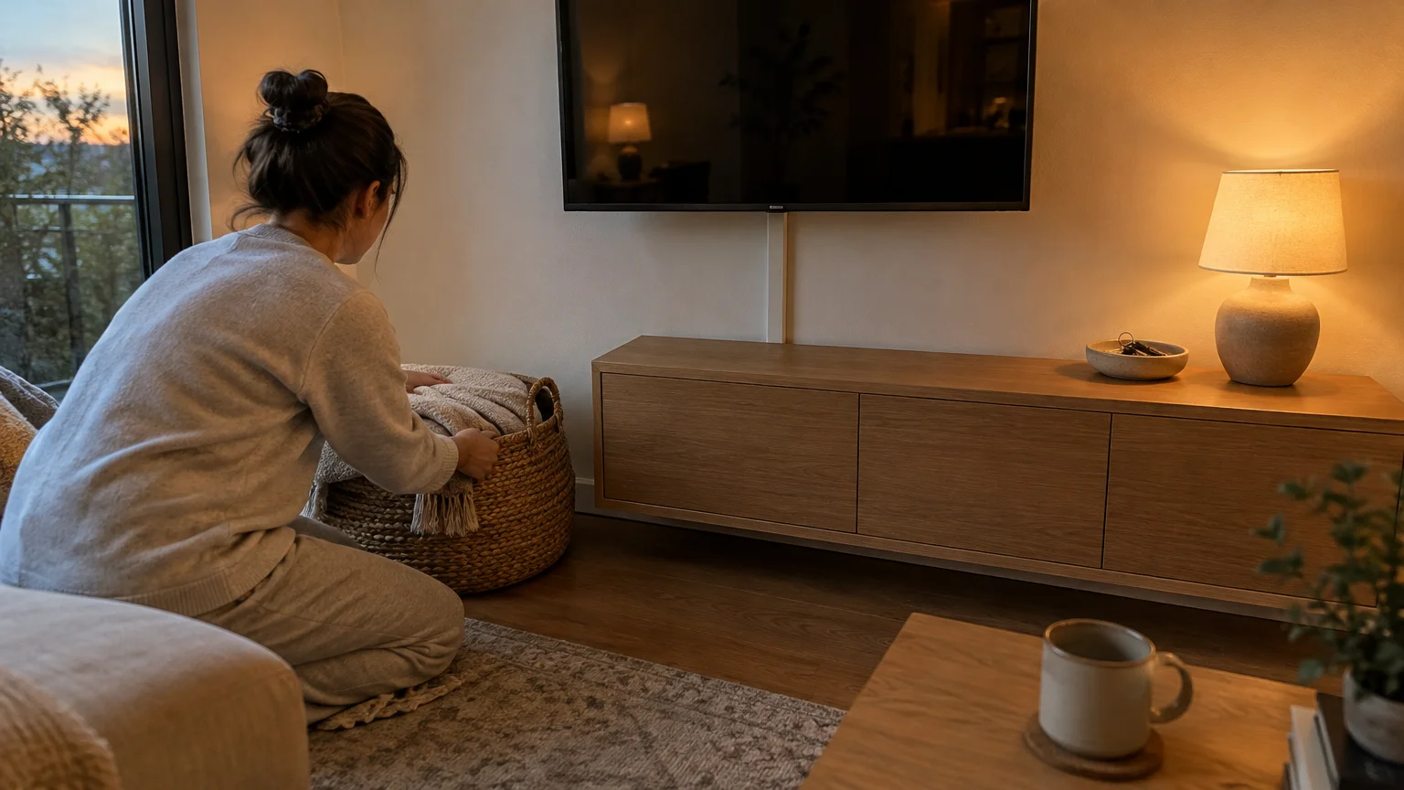
Dedicate ten minutes each evening to resetting all flat surfaces before bedtime. Clearing mail, cups, and loose paperwork off tables prevents clutter from snowballing overnight.
Perform seasonal decor rotations every three months to keep your spaces fresh. Pack away heavy winter textiles in spring rather than layering summer accents on top of them.
Dust lampshades, ceiling fans, and baseboards monthly to preserve room brightness. Clean, reflective surfaces maximize ambient light and maintain an expansive atmosphere.
Inspect wall anchors and furniture anti-tip straps twice a year for looseness. Promptly tighten any shifting hardware to keep your wall-mounted elements secure.
FAQ
How do I know if an area rug is too small?
If your sofa and chairs sit entirely outside the rug boundaries, the rug is too small. A properly sized rug should accommodate at least the front legs of all seating pieces.
Undersized rugs create a disconnected floating island look that emphasizes narrow floor gaps. Upgrading by one standard size immediately expands the perceived boundaries of your seating area.
What is the ideal balance between open and closed storage?
Interior designers recommend a ratio of 80 percent closed storage to 20 percent open display. Closed cabinetry hides functional daily clutter like board games, electronics, and paperwork.
Limiting open surfaces to curated, meaningful accents keeps rooms feeling intentional. This balance reduces dusting duties while ensuring display items remain visual highlights.
Do dark paint colors make a small room feel cluttered?
Dark wall paint does not inherently create clutter if your lighting and furniture contrast well. Deep tones blur wall corners and create dramatic depth when balanced with light accents.
Clutter only happens when dark walls meet dark, bulky furniture and poor artificial lighting. Incorporate reflective mirrors and warm light fixtures to maintain visual openness.
How high should I hang curtains to maximize room height?
Mount your curtain rod halfway between the top window casing and the ceiling line. If your ceiling height is eight feet, mount the rod right below the crown molding.
Let the drapery panels lightly kiss the finished floor without excessive pooling. This vertical continuous line draws the eye upward and exaggerates vertical height.
When should I hire an interior designer or organizer?
Consider hiring an interior designer if your room possesses irregular angles, awkward alcoves, or structural challenges. Professional designers specialize in spatial optimization and custom built-in solutions.
Professional organizers provide invaluable systems if recurring physical clutter overwhelms your daily routine. They help establish custom storage solutions tailored specifically to your family lifestyle.
Takeaway & Next Steps
Correcting these common decorating mistakes restores harmony, expands visual space, and improves daily living. With intentional edits and balanced proportions, every square foot works to your advantage.
First, grab your tape measure and verify all primary walkway clearances around your furniture. Ensure you have at least 30 to 36 inches of unobstructed clearance.
Second, clear every flat surface in your room and curate items using the rule of three. Donate excess accessories that do not serve an aesthetic or functional purpose.
Third, raise your curtain rods and elevate your wall art to appropriate designer heights. These quick adjustments will make your ceilings feel taller before the day ends.
We invite you to share photos of your decluttered spaces with our community. Subscribe to our weekly home renovation newsletter for practical guides, expert styling tips, and budget upgrades.