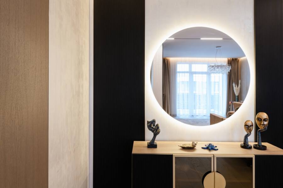
Style & Finishing Touches
Now we reach the core of your design upgrade: selecting the right hues. South-facing rooms require colors that embrace the light without magnifying the glare. Here are the seven surprising colors that works in south-facing rooms when nothing else does, transforming aggressive sunlight into your greatest architectural asset.
1. Chalky Charcoal
Dark gray might seem counterintuitive for a bright sunny room, but a chalky charcoal absorbs intense southern light beautifully. The natural warmth of the sun softens the severe, industrial edge of the charcoal, turning it into a rich, velvety backdrop. This deep shade eliminates glare entirely and provides stunning contrast against bright white trim, natural wood floors, and warm brass lighting fixtures.
2. Dusty Lilac
If you want to inject genuine personality into your interior design, dusty lilac is a masterful choice. The yellow tones of the southern sun neutralize the cool, icy undertones of the purple pigment. The result is a sophisticated, warm mauve that feels incredibly relaxing and elegant. Dusty lilac pairs exceptionally well with brushed nickel hardware and crisp linen window treatments.
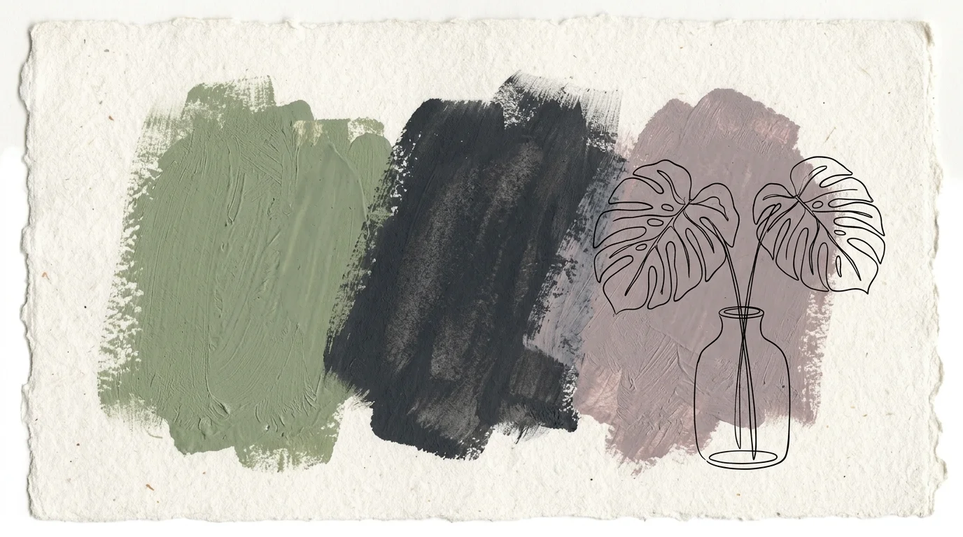
3. Muted Sage Green
Green thrives in natural light, but a vibrant emerald will overwhelm the senses when hit by direct afternoon sun. Muted sage, infused with heavy gray undertones, acts as a visual anchor. The sunlight brings out the earthy, organic qualities of the green without ever letting it turn neon; this creates a seamless, calming transition between your indoor living space and the natural world outside.
4. Ink Blue
Navy blue often reads as black in dark, north-facing rooms, but in a south-facing space, ink blue truly comes alive. The high volume of natural light highlights the subtle marine undertones buried within the dark pigment. Ink blue provides a dramatic, moody aesthetic that still feels vibrant and alive during the day. Pair this color with warm leather furniture and woven rugs for a striking, balanced aesthetic.
5. Greige with Green Undertones
Standard beige turns muddy and yellow in southern light, while pure gray looks cold and institutional. The solution is greige formulated with a faint green undertone. The intense sunlight warms up the gray elements, while the green undertone prevents the beige elements from turning overly yellow or pink. This complex neutral offers immense flexibility, allowing you to easily swap out your seasonal decor and furniture styles.
6. Earthy Terracotta
Many homeowners avoid orange or red in south-facing rooms because they fear the space will feel like a sweltering furnace. However, a heavily muted, earthy terracotta actively embraces the room’s inherent warmth. By choosing a terracotta with brown and pink undertones rather than bright orange, you create a sun-baked, Mediterranean atmosphere. This color works beautifully in dining rooms and living areas where you want to encourage lively conversation.
7. Soft Black
Painting a sunlit room black sounds like a major design risk, but soft black—a black formulated with subtle brown or gray undertones—is an absolute showstopper. The southern light prevents the room from feeling like a cave, instead highlighting the precise architectural shapes of your furniture and art. Soft black walls act as a high-end gallery backdrop, making every colorful accessory and piece of artwork pop with incredible vibrancy.
Finishing the Space
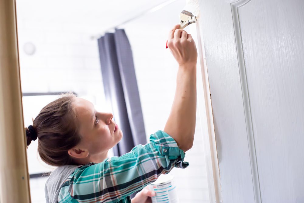
To complete your room, always use a flat or matte sheen on the walls to diffuse light effectively. High-gloss and satin finishes act like mirrors, reflecting harsh glare straight into your eyes. For the trim and baseboards, a soft satin finish provides enough durability for routine cleaning while maintaining a subtle contrast against the matte walls. Upgrade your window treatments to include light-filtering cellular shades or natural linen drapery, allowing you to control the exact amount of sunlight hitting your newly painted surfaces.


Leave a Reply
You must be logged in to post a comment.