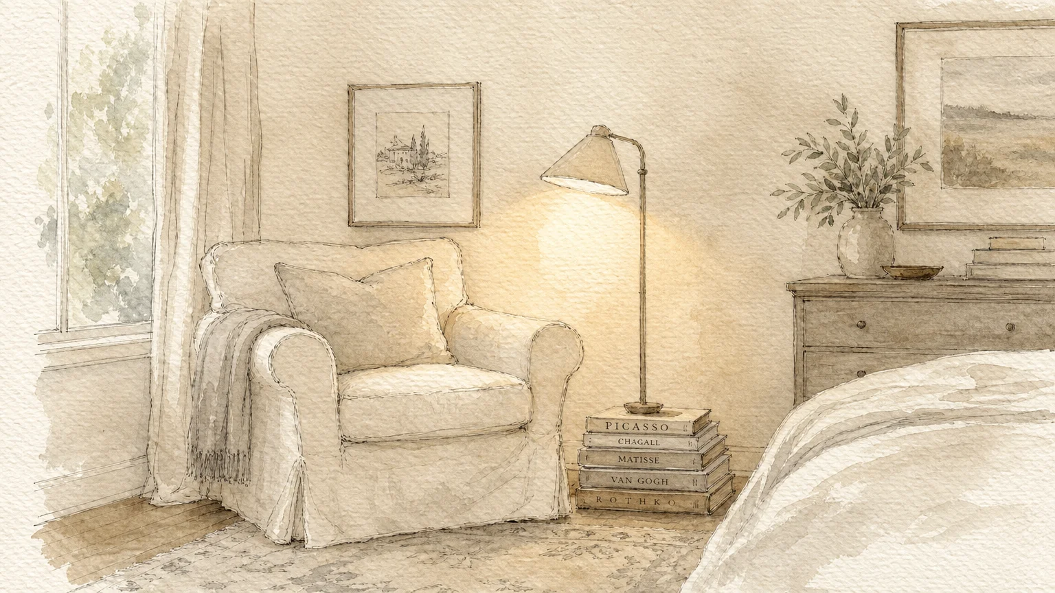
Style & Finishing Touches
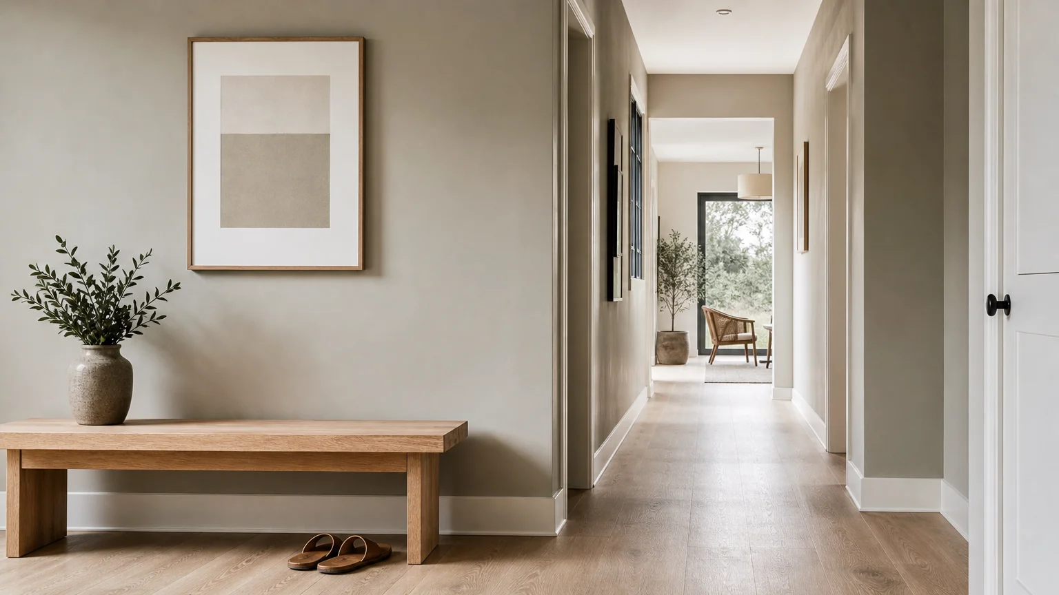
With the physical labor mapped out, you must select the exact hue that will transform your space. Stark white is out; depth, character, and warmth are in. Here are the nine specific paint colors designers say are replacing stark white walls in 2026, offering sophisticated alternatives for every single room in your house.
1. Warm Creamy Alabaster
If you feel nervous about abandoning white entirely, creamy alabaster serves as the perfect transitional hue. Unlike stark, blue-toned whites, alabaster carries subtle yellow and brown undertones. This color reflects massive amounts of natural light while entirely eliminating the clinical chill of pure white. Use it in north-facing rooms to artificially inject the warmth of sunlight, creating a highly inviting, elegant backdrop for rich wood furniture and layered textiles.
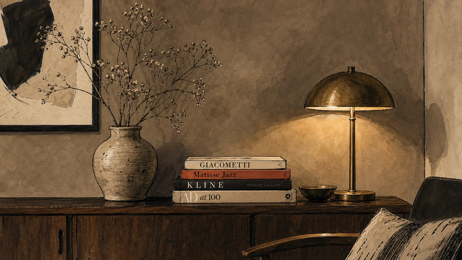
2. Mushroom Taupe
Cool, industrial grays dominated the 2010s, but modern interiors demand a more organic approach. Mushroom taupe expertly bridges the gap between gray and brown, offering a complex, earthy neutral. This color anchors a room beautifully without overwhelming the senses. It looks exceptionally sophisticated in living rooms and home offices, pairing flawlessly with brass hardware, natural stone fireplaces, and rich leather upholstery.
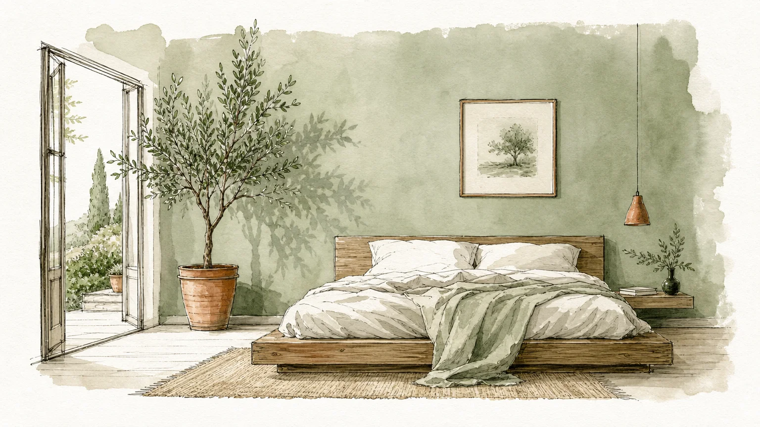
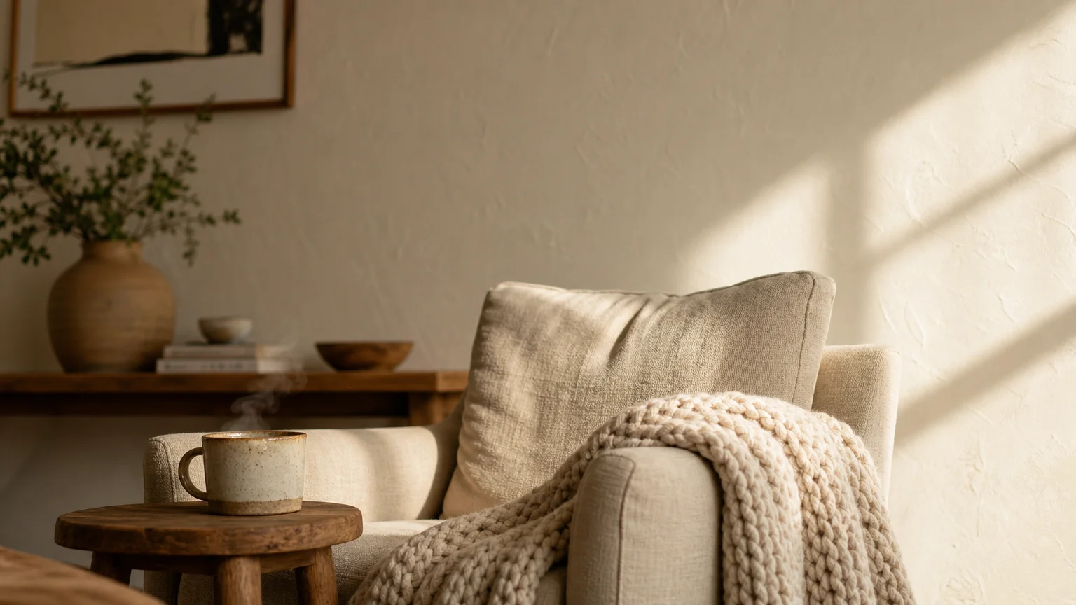
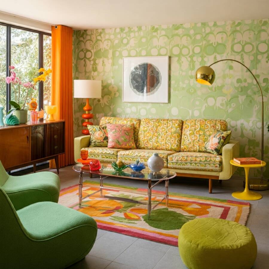
3. Ethereal Sage Green
Designers continuously look to nature to create calming interior environments. Soft, ethereal sage green acts almost as a neutral in modern homes. Because green sits at the center of the color spectrum, it requires zero adjustment from the human eye, making it inherently restful. This muted, dusty green is quickly becoming the ultimate choice for bedrooms and spa-like bathrooms, especially when combined with natural oak vanity cabinets and matte black fixtures.
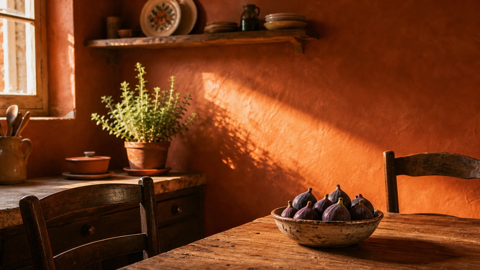
4. Sun-Baked Terracotta
For homeowners craving genuine warmth and drama, sun-baked terracotta replaces white with Mediterranean-inspired energy. This muted, clay-like orange brings profound coziness to spaces that typically feel vast or uninviting. Designers utilize terracotta extensively in dining rooms and creative spaces. When illuminated by warm evening candlelight or modern amber pendant fixtures, terracotta walls practically glow, ensuring your dinner parties feel intimate and vibrant.
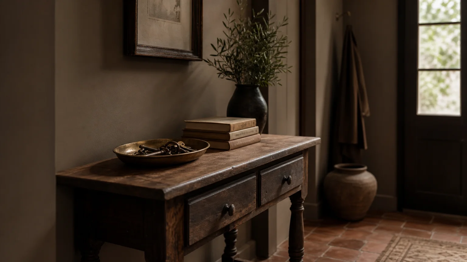
5. Dusty Plaster Pink
Forget the neon pinks of childhood bedrooms; dusty plaster pink represents a highly mature, sophisticated design choice. By mixing a traditional rose hue with heavy doses of gray and brown, paint manufacturers created a color that flatters every skin tone and visually warms up cold spaces. Use this color in powder rooms or dressing areas to cast a universally flattering light, finishing the look with unlacquered brass sconces for a touch of vintage elegance.
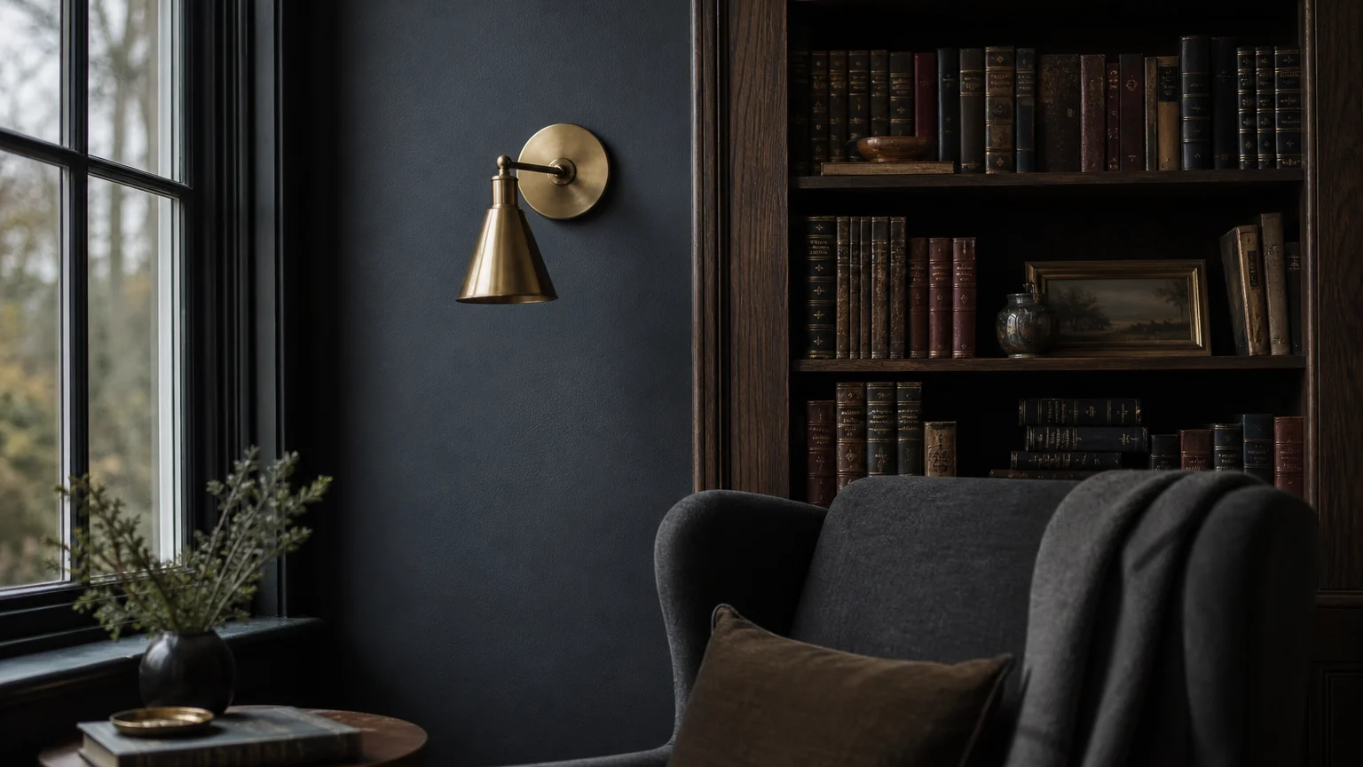
6. Moody Slate Blue
While many 2026 trends focus on warm earth tones, deep slate blue provides a necessary cool-toned contrast for architectural drama. Replacing a white wall with slate blue instantly grounds the space. This color carries heavy gray undertones, preventing it from feeling like a nautical theme park. It works phenomenally well in libraries, media rooms, or as a striking accent on custom built-in cabinetry, particularly when paired with warm walnut wood tones.
7. Caramelized Ochre
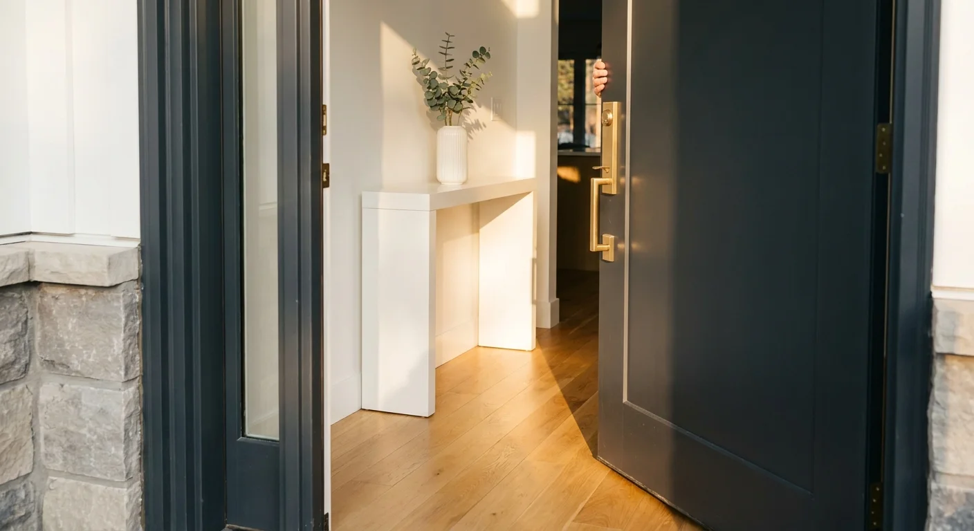
Moving away from stark white allows you to embrace joyful, golden hues without straying into primary-color territory. Caramelized ochre is a rich, mustard-adjacent yellow tempered with deep brown undertones. It mimics the golden hour of sunlight. Designers deploy this bold, enveloping color in entryways and mudrooms to instantly welcome guests with a burst of sophisticated, earthy optimism.
8. Soft Greige with Green Undertones
Standard beige can sometimes feel flat or dated. The modern upgrade is a soft greige—a blend of gray and beige—formulated with a highly subtle green undertone. This chameleon color shifts wildly depending on your lighting; it appears light gray in the morning and transitions to a warm, earthy beige by evening. It serves as an incredibly versatile whole-house color for homeowners who want to establish a continuous, flowing color palette through open-concept living areas.
9. Washed Linen
Washed linen provides the ultimate tactile neutrality. It mimics the color of unbleached natural fibers, offering a highly textured visual appearance even on flat drywall. This hue carries just enough pigment to contrast beautifully against crisp white ceiling trim and baseboards. It is the definitive replacement for builder-grade white, delivering a relaxed, approachable, and highly elevated foundation for any interior design style.
A Note on Sheen: The sheen you choose is just as vital as the color. To maximize the sophisticated nature of these designer paint colors, opt for a matte or flat finish on the walls. Matte finishes absorb light, hiding minor drywall imperfections and delivering a velvety, high-end look. Reserve durable eggshell or satin finishes strictly for high-traffic hallways, kitchens, and bathrooms where moisture resistance and scrubbability remain critical.

Leave a Reply
You must be logged in to post a comment.