
Style & Finishing Touches
The “Sense-Abilities” forecast organizes 2027 home color trends into seven distinct palettes. Review these options to determine which aesthetic best matches your architectural layout and personal lifestyle.
1. Delight: This palette captures the essence of a soft summer meadow. Featuring muted greens and pale, buttery yellows, Delight brings a sense of quiet sensory joy into your space. Apply these shades in nurseries or sunrooms where you want to maximize natural light without overwhelming the eye. Pair these muted tones with natural oak furniture and woven linen textiles to instantly enhance the organic, summery feel.
2. Allure: Channeling the elegance of classic film, Allure delivers dramatic, rich hues. Think deep plums, sophisticated burgundies, and subtle metallic undertones. These colors belong in formal dining rooms or powder rooms where you want to create an intimate, moody atmosphere. Use a high-quality matte finish for these deep shades to absorb ambient light and maximize the rich, velvety drama on your walls.
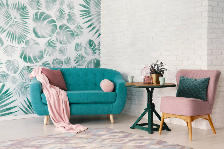
3. Lucid: Grounded in the magic of daydreams and mental clarity, Lucid relies heavily on translucent blues and soft teals. This aquatic-inspired palette works exceptionally well in home offices or bathrooms, offering a calming backdrop that promotes intense focus and relaxation. Extend these soft teals directly onto the ceiling to create an immersive, jewel-box effect in smaller, windowless spaces.
4. Hush: Sometimes, the most powerful design statement is a whisper. The Hush palette utilizes barely-there taupes, muted midtones, and soft grays to promote absolute health and wellness. Paint your primary bedroom with these shades to create an instant, distraction-free sanctuary. Incorporate warm, dimmable LED lighting in rooms painted with Hush to maintain the soft, wellness-focused ambiance long after the sun goes down.
5. Honest: Rooted in the warmth of comfort food and natural materials, Honest features baked terracotta, warm amber, and spiced reds. Bring these welcoming, earthy tones into your kitchen or family room to create a space that encourages heavy gathering and lively conversation. Complement terracotta walls with matte black hardware and vibrant green houseplants to firmly anchor the earthy aesthetic.
6. Grounded: Prioritizing longevity and stability, the Grounded palette introduces deep forest greens and rich bark browns. Use these strong, foundational colors for wainscoting, entryway accents, or custom built-in cabinetry to anchor your larger living spaces. If a full room of forest green feels too heavy, apply this palette exclusively to the bottom half of the wall below a crisp, white chair rail.
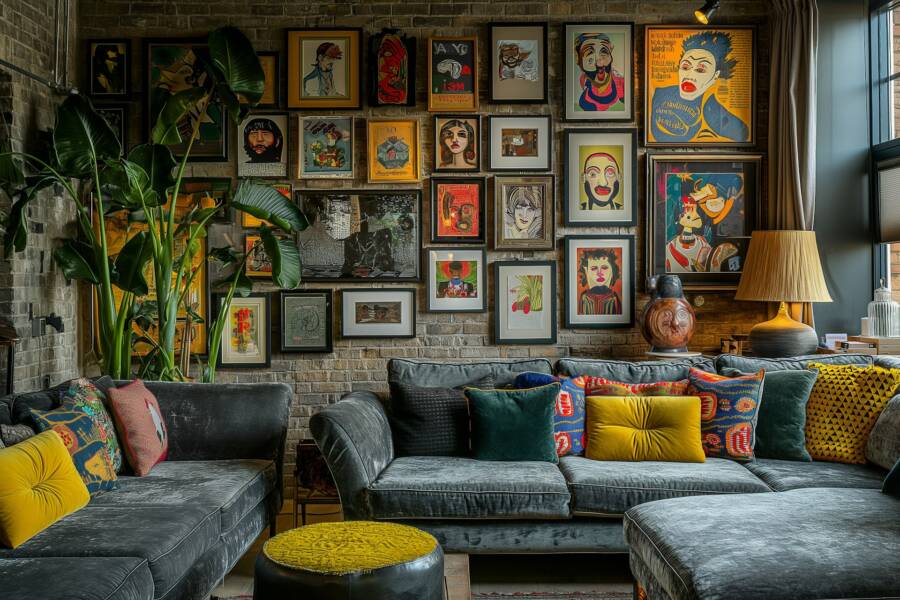
7. Elation: When you need a burst of euphoria, turn to Elation. Anchored by vibrant, electrifying hues—including the highly anticipated Luminous Blue—this palette commands immediate attention. Reserve these high-energy colors for accent walls, front doors, or creative studio spaces where you want to spark imagination. When using intense shades like Luminous Blue, always prime your walls with a gray-tinted primer rather than stark white to ensure full opacity in just two coats.


Leave a Reply
You must be logged in to post a comment.