Style & Finishing Touches
Selecting a shade that withstands the test of time means looking past fleeting internet fads. The most enduring interior design palettes draw inspiration from nature, historical architecture, and classic textiles. Incorporate one of these ten accent colors to elevate your home decor with total confidence that it will still look perfectly intentional ten years from now.
Navy Blue
A deep, nautical navy blue offers the striking drama of a dark color without the stark harshness of pure black. Navy provides a sophisticated, classic backdrop for metallic hardware, especially unlacquered brass or polished nickel. Use this shade on living room built-ins, dining room wainscoting, or as a grounding color for lower kitchen cabinets.
Sage Green
Bringing the outdoors inside never goes out of style. Sage green features subtle gray undertones that allow it to act as a calming neutral while still injecting life into a sterile room. It pairs beautifully with natural wood tones, crisp white trim, and organic textures like linen and woven rattan.
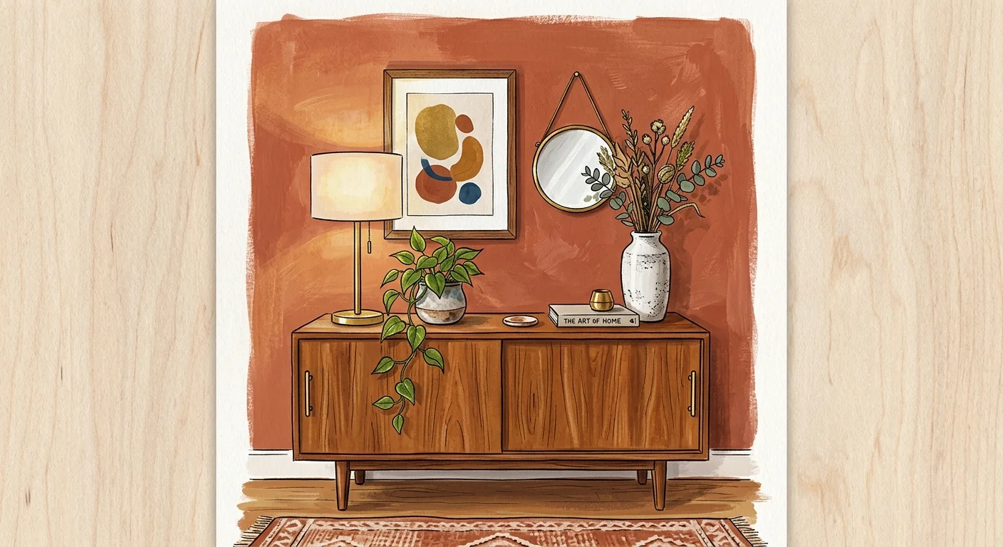
Warm Terracotta
Earthy terracotta bridges the gap between orange, brown, and red, delivering immense warmth to North-facing rooms that receive cool natural light. This baked-clay hue shines in dining rooms and entryways, creating an inviting, sun-drenched atmosphere that feels both globally inspired and deeply traditional.
Charcoal Gray
If you want a modern, moody aesthetic, charcoal gray delivers unparalleled elegance. Unlike cool, blue-based grays that feel industrial or sterile, a warm charcoal wraps a room in incredible coziness. It serves as an exceptional backdrop for vibrant artwork and large-screen televisions, making it a highly practical choice for media rooms and dens.
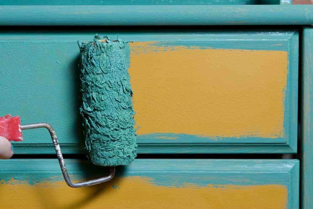
Mustard Yellow
While bright lemon yellow easily overpowers a space, a muted, earthy mustard brings cheerful sophistication. This heritage color looks absolutely stunning when paired with dark walnut woods, navy blue upholstery, and vintage leather. Apply mustard yellow to a guest bedroom accent wall or a small powder room for a striking pop of personality.
Soft Black
Embracing a soft, washed black—often leaning toward a dark, chalky slate—creates instant architectural interest. Painting interior doors and window casings in soft black frames your outdoor views beautifully. This simple upgrade adds a high-end, custom touch to standard builder-grade finishes.
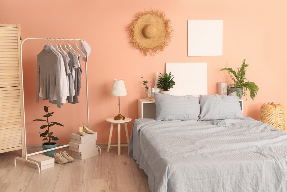
Dusty Rose
Moving far away from childish bubblegum pink, dusty rose utilizes complex brown and gray undertones to achieve a mature, soothing presence. This muted blush tone works exceptionally well in guest bedrooms, home offices, and bathrooms. It flatters all skin tones and bounces warm, welcoming light around the space.
Slate Blue
Slate blue combines the tranquility of light blue with the grounded sophistication of stone gray. It remains an absolute staple in coastal and transitional home decor. Because cool colors naturally recede visually, painting a ceiling or a long hallway in slate blue tricks the eye into perceiving much more expansive room dimensions.
Forest Green
Deep, saturated forest green brings a sense of historic library charm to modern homes. This rich shade looks incredible in high-gloss finishes on millwork or in a velvety matte finish on a primary bedroom wall. It effortlessly bridges the gap between classic traditionalism and modern moody design trends.
Greige
When stark white feels too clinical and standard beige feels terribly dated, greige strikes the ultimate balance. This warm blend of gray and beige serves as a soft, adaptable accent against bright white primary walls. Use it on interior trim, interior doors, or fireplace mantels to add subtle definition without committing to a heavy, overpowering color.


Leave a Reply
You must be logged in to post a comment.