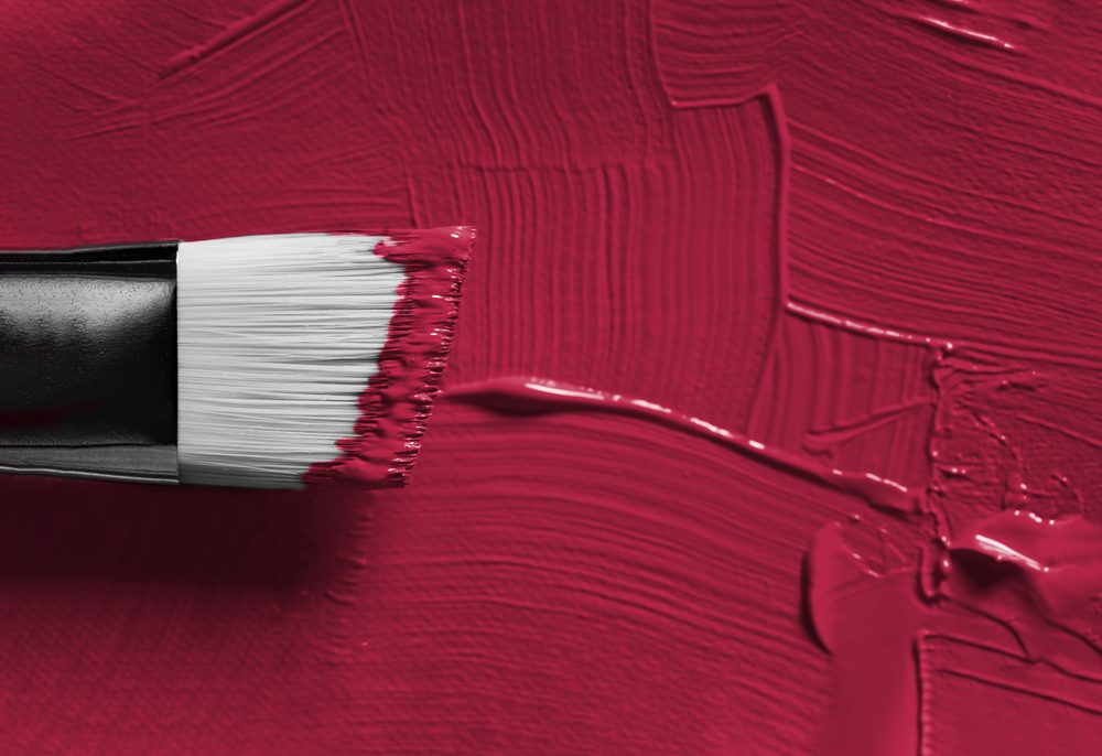
You Need to Try One of These 11 Trending Paint Colors!
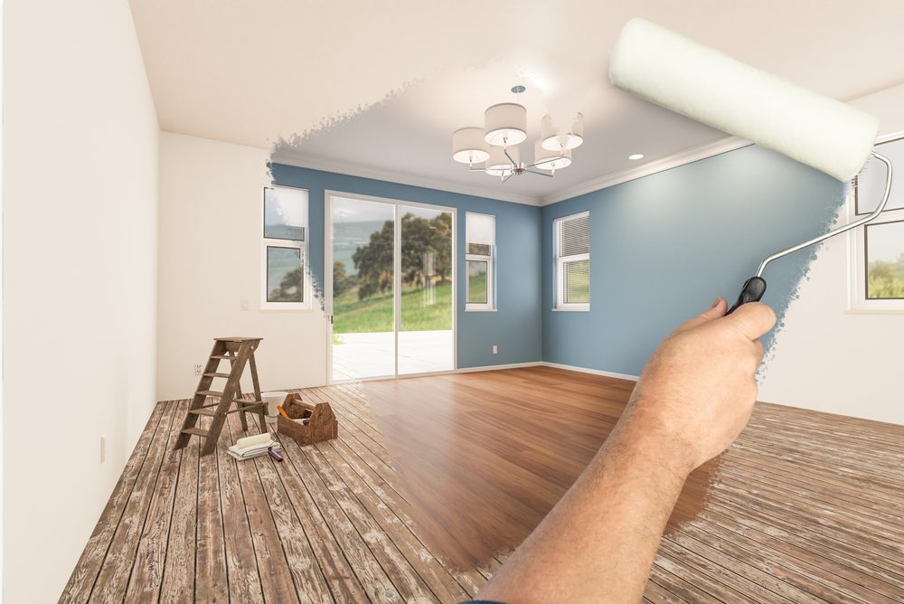
Now it’s definitely the most colorful time of the year. So if you’ve been planning a specific paint project or you’re suddenly inspired to add more color to your walls, then you will find this article super helpful.
As it turns out, feeling the blues never felt so good. Now, we have a list of alluring mid-tones that balance depth and intrigue with classic appeal and reassurance.
Besides the moody hue, we enlisted some of the trendiest paint colors for 2024, which also include brand-new paints that will bridge the gap between contemporary and classic styles. You will definitely find the next dreamy wall color here:
Cracked pepper
If you’ve decided to embrace a moodier, edgier color palette for your home, then you should try the color of the year: cracked pepper. So we deeply encourage all homeowners to take the leap and try the color.
The versatile soft black hue is somehow neutral, but it also creates a grounding shade that distances from the classic white-and-cream colors.
The moment now is all about optimism, awakening the senses, and also elevating how you feel, and a room with a soft black truly checks the box on all of those things.
Cracked pepper works just fine with everything from dusty pastels and metallic accents to earthy shades and strong patterns and textures.
Sherwin-Williams: Upward
One of the biggest paint color trends that we have to anticipate in the coming year is blue, a specific shade of Sherwin-Williams that will be super big in 2024.
The lauded paint brand chose this shade, which is a blissful blue inspired by coastal aesthetics. This is also the color of the year. We knew that lighter tones would be very important in 2024 and 2025, and that’s why we wanted to forecast the difference from earthy neutrals to lighter expressions and a light blue.
The hue complements a wide range of home design styles and looks great with antiques, modern furniture, transitional pieces, and even boho interiors.
Glidden: Limitless
Glidden by PPG’s color of the year rings super true to its name: limitless. In reality, we’re talking about a honey beige hue that has the capacity of a primary color but the essence of a neutral.
Now, we’re entering a new era of explosive creativity and change. Consumers want to use color in more unconventional ways, and they will need a palette that has the same versatility to work with in both new and old decor. Well, this is the perfect way of bringing color into your space without moving too far from the neutrals so many owners love.
Valspar: Renew Blue
Cool blues and greens have long dominated interior spaces over the last couple of years, and truth be told, we don’t see that trend going away any time soon.
The brand decided that Renew Blue, a soothing blue with green undertones, is the next best thing for 2024. As we know, blue is a classic shade that also became the new neutral.
It can be easily mixed and matched to fit a wide variety of design styles and applications. The color is saturated enough to stand on its own, but it can also be used as an accent shade for woodwork, entryway doors, and even cabinetry.
Minwax: Bay Blue
You can breathe some new life into the wood accents around the house with Bay Blue. This is the intersection between contemporary and classic.
The 2024 color of the year is one of the richest choices you can think of, as it will elevate and enhance the natural wood within your home. It’s also a perfect shade mix between blue and green, as it can transform traditional heirlooms into modern show pieces. Moreover, you can find it in both solid and semi-transparent wood stain opacities.
C2: Thermal
Another interesting shade of blue that’s expected to dominate the market is the C2 Thermal. It’s a refreshing shade that, somehow, is both calming and exciting.
It also infuses interior spaces with the peacefulness of the outdoors. C2 Thermal reminds us of a vast blue sky and the infinite range of blue hues that nature offers us to restore our mood.
The bespoke pale but punchy blue is definitely built for adventure and brimming with tons of hope, evoking different feelings of loyalty, trust, and even confidence.
Dutch boy paints: Ironside
Dutch Boy Paints decided to go with Ironside as the 2024 color of the year. This deep olive hue is meant to serve as a moodier, cozier upgrade to the already-old sage green shade that defined paint trends over the last couple of years.
Ironside is also made to create a space that is both elegant and welcoming. Creating a space for wellness should be an important factor in everyday life.
That’s why taking a natural approach to the healthiest living and safest spaces is so important when it comes to current landscapes.
Graham & Brown: Viridis
Graham & Brown’s long-awaited shade of the year, Viridis, is making a lot of waves out there. I gotta warn you! It is a complex yet versatile shade that adds a ton of depth to any space.
That deep green hue can be easily used in small and cozy spaces to create that desired calming effect. In larger rooms, it works even better, as it completely transforms the space into a sophisticated respite. You should give it a try!
Krylon: Bluebird
This is yet to be my favorite one. A bold twist on pastel blue, Krylon’s Bluebird leans into the resurgence of what we know as vintage and eccentric home decor.
It successfully infuses a certain sense of personality into any interior space, regardless of its dimensions. The brand’s color of the year is certainly uplifting while also comforting.
Bluebird brings joy and contentment within any space, embracing consumer desire for something known as “dopamine decor”.
Bluebird is also a welcoming color that effortlessly harmonizes both warm and cool shades but also facilitates a certain balance in pairing accent colors, vintage furnishings, and, of course, modern elements.
Dunn Edwards: Skipping Stones
Dunn-Edwards’ color of the year is the one and only Skipping Stones, a calming but gentle blue hue with little hints of green and gray. The serene shade has the much-needed versatility of a neutral tone, meaning you can easily use it to cover all four walls in a bedroom or even a bathroom.
Moreover, you can add a splash of color to your front door or ceiling, too. Skipping Stones feels no less than a daydream, and it can also add a sense of mystery and thoughtfulness to any space.
Benjamin Moore: Blue Nova 825
Benjamin Moore also decided to go blue next year. The brand’s 2004 color of the year choice is Blue Nova 825, which is a beautiful and unique blend of blue and violet.
But wait, because the story of how they decided on this color is worth telling: they were inspired by the brilliance of a brand new star being formed in space. What a time to be alive, right?
The shade can be used on all four walls or, if you prefer, as an accent for a pop of color. Blue Nova 825 is an alluring mid-tone that successfully balances depth and intrigue with its classic appeal and reassurance.
If you enjoyed reading this piece, we also recommend reading: 12 Halloween Decorations That Will Spook the Soul Out of Your Neighbors!


Leave a Reply
You must be logged in to post a comment.