Style & Finishing Touches
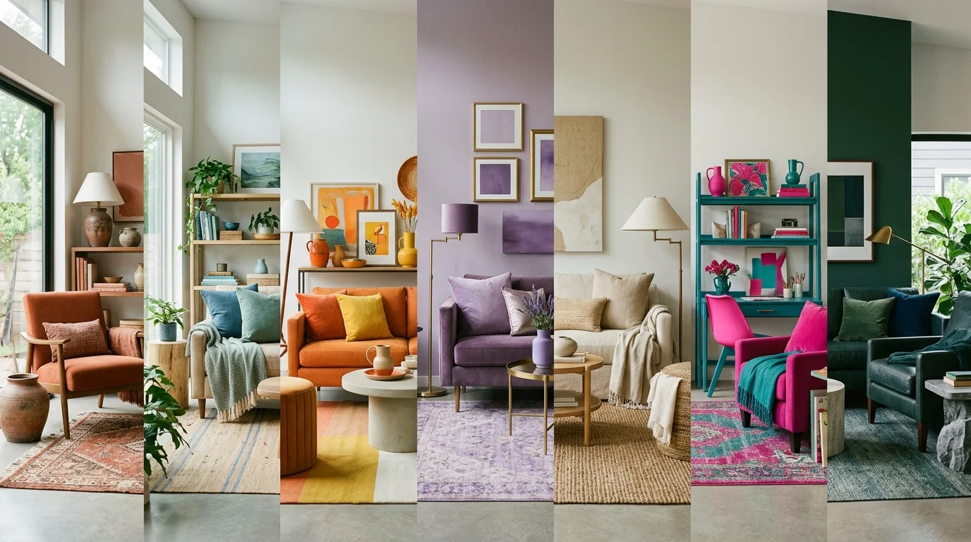
The standard advice for homeowners with unpainted trim is to stick to boring off-whites. You can achieve a much more sophisticated look by leaning into bold, intentional color choices. Here are ten unexpected paint colors that create stunning visual harmony with natural wood.

1. Muted Sage Green
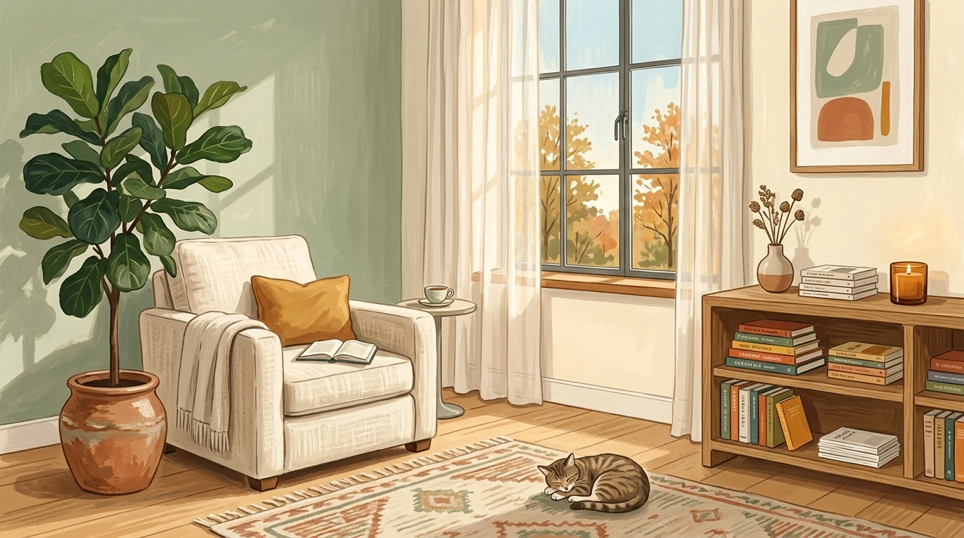
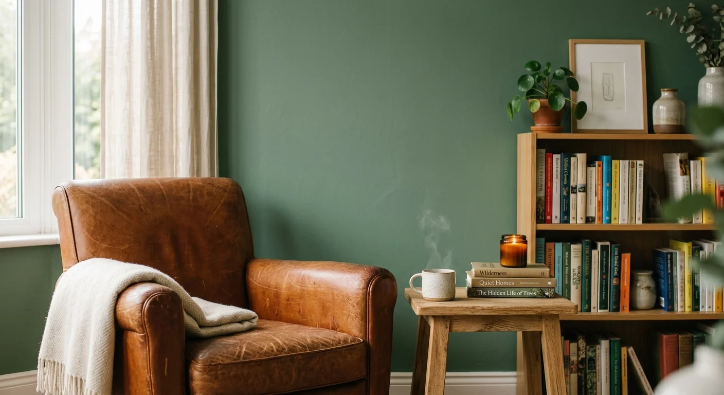
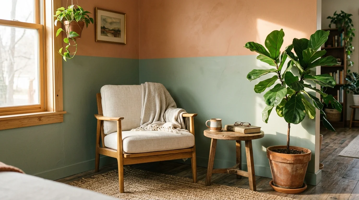
Sage green acts as a phenomenal neutralizer for wood tones that pull too much red or orange, such as red oak or Brazilian cherry. Because green sits opposite red on the color wheel, a muted sage tempers the aggressive warmth of the wood without feeling sterile. The dusty, gray undertones in the green give the room an organic, earthy feel that mimics nature. This pairing works exceptionally well in living rooms and bedrooms where you want to foster a restorative, calming environment.

2. Deep Navy Blue
If you have classic yellow pine or honey oak, deep navy blue creates a spectacular, high-contrast maritime aesthetic. The rich, dark backdrop makes the golden hues in the wood absolutely glow by comparison. Navy provides a traditional, tailored look that instantly elevates the perceived value of builder-grade pine trim. Use this color in dining rooms or home offices to create a sense of distinguished library elegance.

3. Dusty Plum
Pairing purple with wood might sound intimidating, but a desaturated, dusty plum looks incredibly luxurious against dark, cool-toned woods like walnut or espresso-stained ash. The warm red undertones in the plum draw out the subtle complexities in dark wood grains. This unexpected combination creates a moody, intimate atmosphere perfectly suited for a primary bedroom or a cozy reading den.

4. Charcoal Black
Black walls paired with natural wood offer the ultimate modern, architectural statement. A soft charcoal black absorbs light and blurs the physical boundaries of the room, making standard wood features pop like fine art in a gallery. This approach works miracles on mid-century modern homes featuring teak or birch paneling. Ensure your room has ample natural light to prevent the space from feeling overly heavy.

5. Terracotta
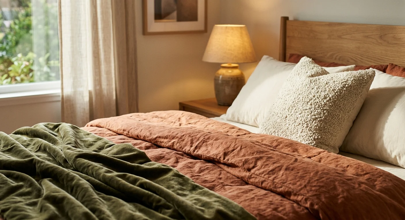
Instead of fighting the warmth of cherry or mahogany wood, you can lean into it by wrapping the room in a rich terracotta. This creates an analogous color scheme—using colors next to each other on the wheel—that results in a baked, sun-drenched aesthetic. The monochromatic warmth feels incredibly welcoming and works beautifully in kitchens or entryways where you want to instantly embrace your guests with a sense of comfort.

6. Pale Mustard Yellow
While bright primary yellow clashes terribly with most timber, a pale, muddy mustard yellow offers a gorgeous retro charm when paired with medium-toned woods like maple or hickory. The muted yellow highlights the subtle blonde streaks in the wood grain. This cheerful, eclectic combination feels distinctly historical, making it an excellent choice for craftsman-style bungalows or vintage kitchen renovations.

7. Smoky Teal
Teal brings together the calming properties of blue and the organic energy of green. A smoky, gray-washed teal serves as an ideal backdrop for heavily grained, rustic woods like cedar or reclaimed barn wood. The cool vibrancy of the teal cuts through the heavy, rugged texture of the wood, bringing a crisp, contemporary edge to spaces that might otherwise feel like a dark cabin.

8. Lavender Gray
Selecting wood trim paint colors often means navigating tricky lighting. A soft lavender-tinted gray provides a brilliant solution for rooms with warm-toned wood that receive harsh, southern-facing sunlight. The subtle purple undertone in the gray cools down the intense afternoon light and provides a delicate, sophisticated contrast to heavy oak staircases or thick ceiling beams.

9. Olive Drab
For a truly grounding, historical look, pair natural wood with a dark, muddy olive green. This color looks spectacular alongside unstained, rough-sawn timber or lightly oiled pine. Olive drab brings a sense of historical permanence and rugged outdoorsy charm. It serves as an excellent backdrop for leather furniture, brass hardware, and vintage rugs, making it ideal for a den or a heavily used family room.

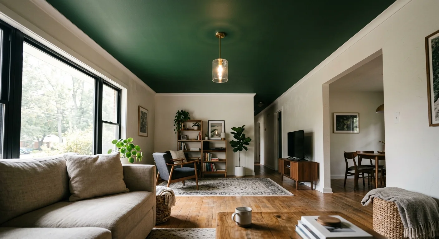
10. Saturated Emerald
If you want to inject pure glamour into your home, paint your walls a saturated, jewel-toned emerald green. This dramatic hue provides a breathtaking contrast against light, blonde woods like ash or birch. The stark difference between the pale, airy wood and the dense, luxurious green creates a jewel-box effect. This bold choice dominates powder rooms or small dining areas, turning them into unforgettable conversation pieces.

Leave a Reply
You must be logged in to post a comment.