Interior designers swear by these color rules!
We don’t know if you are a fan of following rules or not, but interior design is full of them, and if you want your home to look its best, you should try to stick to them. This is why we have prepared a set of color rules inspired by the advice of the most well-known popular designers. As long as you decorate according to them, you can’t go wrong.
Don’t think about it as a complicated process because it’s really not. The color rules we are about to share with you are simple and require minimal effort. Also, you can apply them in any space. You’ll see that some are specific to some spaces, but most of them can be used everywhere.
What we’re trying to say is that you don’t have to redecorate and repaint your house from zero, so these rules make sense. No. They are pretty versatile and you can adapt them according to your specific conditions.
Are you curious now? Just keep reading and find out how to be the best at decorating! We can guarantee that everyone will be jealous when they see how good you are at using colors. You’ll be the master of colors!
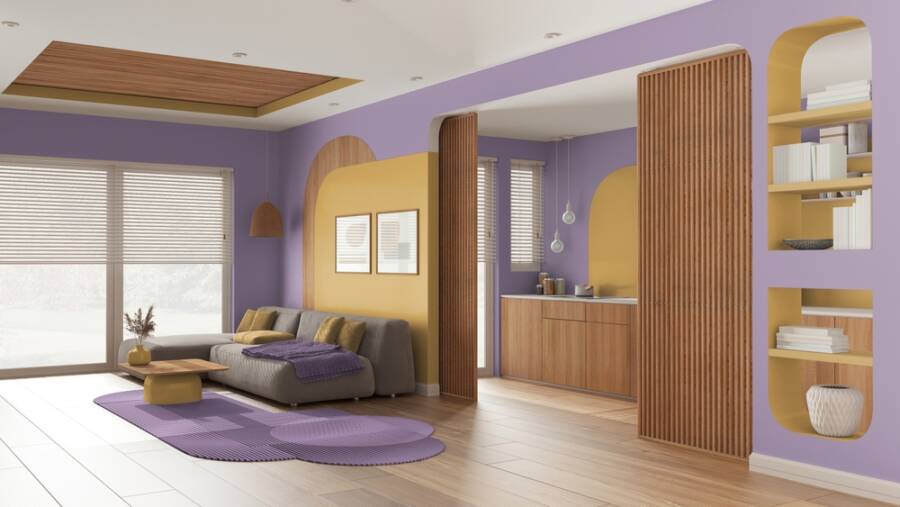
Colors aren’t absolute; they are relative to their surroundings
This is one of the most powerful color rules and a principle you should stick to. If you want to be good at interior design, you need to understand that that color is relative to the color next to it. But what does this mean?
It means that any color will change its appearance based on the colors that surround it. This is a dynamic relationship that can transform the space, and you can use it to your advantage.
Designer Sabra Ballon of BallonSTUDIO draws inspiration from the color theories of artist Joseph Albers, who believed that colors interact with each other in complex ways. She says that colors are not about favorites, and you should learn the color rules and understand how they interact with one another.
Complementary colors are a good example. Yellow and purple, blue and orange, red and green. Put them together, and they will always look good because they balance and enhance each other.
Choose the rug first
When you want to decorate a room, it is important to choose a color palette first. We know that this can be extremely difficult sometimes, and this is why you might want to narrow down that palette.
According to the color rules, a smart way to do this is to start with the largest item in the room. You choose the color of this one first and then organize everything based on it. Interior designer Debbe Daley of Debbe Daley Designs suggests that you can start with the rug because many times this is the largest, most visually engaging element in a space, and this makes it a focal point.
View the rug as the color map of the room. Use the color palette offered by the rug, and you will choose more easily the color of the walls, furniture, or even small decor like pillows or curtains.
The color wheel is your friend
This is one of the color rules that might take you back to an art class but is probably the most important. The color wheel is a fundamental tool that all designers use to create balanced, visually pleasing color schemes.
Art and science will always blend when we talk about colors and will show us how different hues interact and influence each other. We can use this to get a sneak peek into what will work best in our home.
If you want your space to look peaceful, you can never go wrong with a monochromatic palette. This means you will choose a main color and then layer various shades and tones of the same color throughout the space. This creates a more unified look and a relaxing atmosphere.
If you want to try something bolder, experts recommend playing with complementary or triadic color schemes. Complementary colors are known for creating more dramatic looks, and a triadic palette uses three colors evenly spaced around the wheel to offer an ambiance full of energy.
The 60-30-10 rule
This is one of the most trusted color rules in interior design, and knowing how to use it correctly can totally change the way you see colors and redecorating. Designers love this rule because it makes the spaces more balanced and visually appealing.
So, let’s see how it works. The concept is very simple. 60% of your room should have a primary color, 30% a complementary color, and then the rest of 10% needs an accent color. This is the recipe for the perfect visual cocktail, to put it more simply.
The 60% is the main color and sets the mood of the room. Generally, it covers large areas such as walls and rugs. Then the complementary 30% adds depth and dimension, and you can introduce it through furniture and curtains.
Last but not least, the 10% is the one that creates the “WOW” factor. Is the accent color, and you can get creative with it. Pillows, art, and lamps find a color that catches the eye and complements the story of the room.
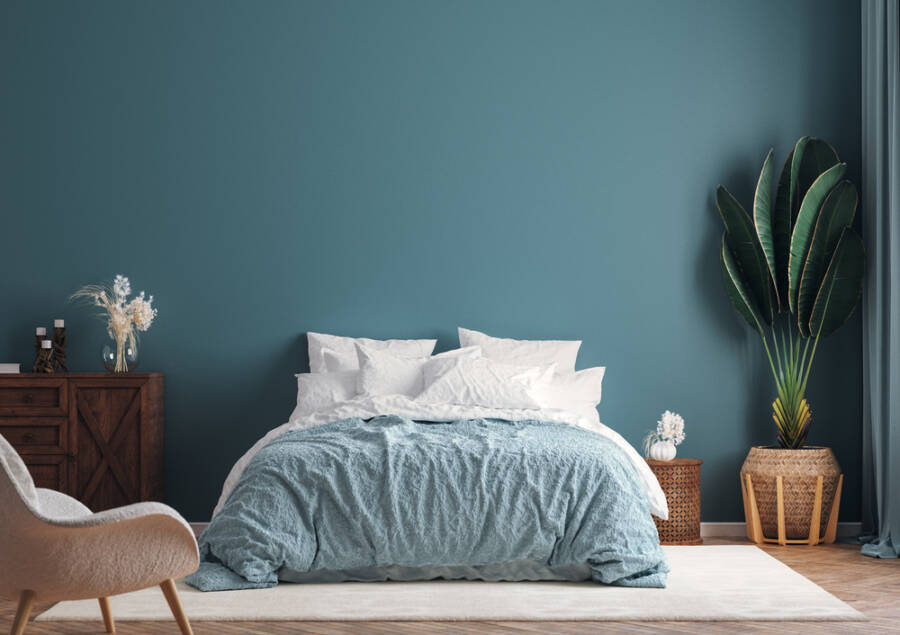
Neutrals should always be there
Maybe you find them boring, but one of the color rules tells us that neutrals are a staple because they create balance and harmony in a space. Even if you want to have the boldest room, you need to let the eye rest, and this is where neutrals come into play.
For example, if you have a more powerful color on your walls, you can pair it with a neutral-toned sofa. This contrast creates balance and will make your room look better than ever. If you’ve designed a more sophisticated room with accent colors and dark walls, you can step up the neutral items and use curtains and rugs for this.
Also, another thing about neutrals is that they are very flexible, and this is only good news because you can keep them as your taste evolves. A tame palette of browns, grays, or creams can serve as a blank canvas, giving you the opportunity to play with accent colors and all the changes that come and go with the trends.
Warm and cool tones go great together
This is another one of the color rules we advise beginners to start with. It makes the room more interesting by giving it a dynamic appearance and depth while also keeping a harmonious structure.
Warm tones such as reds, yellows, and oranges can instantly make a space look more cozy. They create an intimate feeling perfect for living areas where friends and family gather.
On the other hand, cooler tones such as blues and grays are the refreshing element. They create a feeling of distance and formality, but when you combine them with warm tones, they will make the space feel clean and crisp.
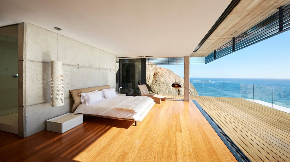
You can mix them by choosing a flooring option that naturally comes in a warmer color. Hardwood floors are perfect for this. Then, to combine the two tones, you will choose a cooler wall paint. Both elements will shine without competing for attention, and this is exactly what we are trying to achieve.
If you want to learn more about color rules, this might be helpful: Mcbazel 3 Pieces Color Mixing Guides Wheel, Paint Mixing Learning Guide
You should also read: Which Design Era Should You Be Living In?






Leave a Reply
You must be logged in to post a comment.